The 80's were a pretty strong decade for suit designs so now lets move on to the 90's.
Chikyuu Sentai Fiveman:

The big Vs going across the torso look pretty cool and without them the design might be a little too simple. The yellow highlights work well on all five suits. Its also really rare to see them on a yellow suit as normally they'd be replaced with black so they can be seen more easily. The helmets look nice and I like each one has its own emblem on the forehead. The white stripes going down the middle looks good alongside their respective colors. Its a nice touch and it keeps the helmets from simply being one solid color. Red's has a nice little extra bit of flair since his stripe enters the visor of his helmet. It even ends in a little arrow that matches the shape of his visor. I like the segmented visors but I kinda think they went overboard on Yellow and Pink's. They don't look bad per say, more so that they are segmented in a way that looks unnatural given with the visors' shapes. The yellow bands looks good on the white gloves and boots. Overall while not one of the first designs I think of when it comes to this decade, its a perfectly fine design.
Chojin Sentai Jetman:

The bird insignia on the chest looks pretty cool and I love how it wraps around the shoulders. The helmets on all 5 suits look pretty cool and they get the bird motif across really well. They also sort of complete the bird insignia on the chest. The silver mouthpieces look alright on each helmet. The yellow highlights on every Jetman besides Yellow Owl look pretty good with all their main colors. In Yellow Owl's case the highlights are black and they were rather well with the his color. Blue Swallow marks the first time that this shade of blue has been used and it works well with her overall design. The white portions of the suits work well for the ones that they're on. I think they look pretty good and compliment their main colors rather well. I think they look the best on Blue Swallow as there is just something about how that shade of blue mixes with the white and the accompanying yellow highlights. Its probably because its a nice light shade of blue as opposed to all the standard blues the franchise has had before now. It makes the suit feel like it has this sort of shimmer to it. Due to white being her main color, the bits on White Swan's chest and legs are pink instead. The bird emblem on the belts is the icing on top of these designs. Overall these suits are one of my favorites of this decade and Blue Swallow is probably my fav design on this team.
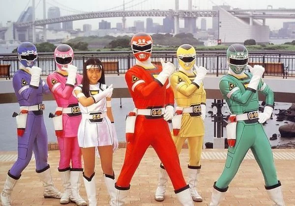
Kyoryu Sentai Zyuranger:

They're rather simple but pretty distinct. The white diamond pattern on the main five's chests looks pretty good. The diamond patterns on their boots and gloves are a nice contrast to that since its in their main colors. The white trim on PteraRanger's skirt is a nice touch.The Dino Bucklers on the belts really ties the main five's suits together. The sculpting on all six helmets is great and there is a nice amount of detail on them. I particularly like the sculpting on MammothRanger's trunk/tusks and TigerRanger's fangs. MammothRanger's trunk even goes into his visor. PteraRanger's helmet looks nice thanks to the mixture of white and pink. Most of her helmet is actually white and I love it because it give the pink portion a sort domino mask or faceplate-esque look. Her Pteradon head even extends down into her visor. Its notable because unlike PteraRanger and MammothRanger, the other four's visors are the mouths of their dinosaurs. DragonRanger's suit looks cool. Its a tweaked Zyuranger suit obviously which is to be expected because its a sixth ranger suit after all. His gloves and boots have gold bands on them and a spike pattern instead of a diamond pattern. The chestplate looks cool and the center replicates the diamond that the other Zyuranger's have. The gold on the suit makes the green pop really well and the gold Dino Buckler brings his look together.
Gosei Sentai Dairanger:

The helmets get their mythical beasts across nicely. All six stand out pretty well and I think my favorite helmet might be RyuRanger's due to how well the black on the forehead works with the gold and red. The silver mouthplates look cool and each one has a slightly different design. I think HououRanger's mouthplate looks the best and works with her phoenix motif since it resembles a bird's beak. The white torso on the main five's suits balance out their colors really well. It really captures the martial artist look and gives the suits a very classic vibe. The white bands with gold outlines on the boots and gloves look cool and that color combo really makes their main colors pop. The gold trim on HououRanger's skirt is a nice touch. I particularly like the Dairanger emblem because of how well it uses all 5's colors and its neat that it looks a little bit like a fist. Kibaranger's suit is cool cuz its just a Dairanger suit with a chestplate added. The gold and black works well on the chestplate and I like the emblem in the center but I do think its a little too big. The gold bands on the boots and gloves being outlined in black looks pretty good and all the gold in his suit in general really makes the white pop.
Ninja Sentai Kakuranger:
The suits look exactly how you'd expect a ninja team to look. They're pretty much a perfect example of the "less is more" approach and there is a lot of beauty in that. The gold headbands look pretty cool on all 5 suits and each one has a different symbol on it. The gold belts on Red, Blue, Black, and White work well with their colors. NinjaBlue is a nice light shade of blue which is interesting as its the only time that I know of that a male blue ranger has used that shade. Yellow and Black's suits probably make the best use of the black and white bands on the gloves and boots out of the whole team. For Yellow, its probably because the bands match his belt and it completes his look rather well. The V's on the torso work well to break up the simple design. The black around the necks is a nice touch and I especially like that the tips of the V's are gold (well black in Yellow's case).
Choriki Sentai Ohranger:

The suits have this ancient vibe to them. The helmets look alright and the visors on the main five look good outlined in white. The sculpted mouth-pieces matching each one's respective colors is cool and it kind of reminds me of those Easter Island statues. The weathered gold on the main five's torsos looks pretty good and there is quite a lot of detail on that portion. It looks almost like its engraved metal even tho its still spandex. The gold bands compliment the white gloves and boots rather well as does the white neckline on the torso. The gold trim on Pink and Yellow's skirts is a nice touch. KingRanger's suit looks the best to me, mostly cuz its an Ohranger suit with extra gold armor added to it. The sculpting on his chestplate is great and there is some nice detail in there. His visor looks good outlined in gold. The white gloves and boots really compliment the black spandex and gold armor. The gold belts on all 6 suits look pretty cool and even include all of their shape symbols.
Gekisou Sentai Carranger:
Ignore White Racer for the moment as I couldn't find a decent looking pic without her and hers isn't really a suit per say. These suits look pretty stellar and I love the car panel designs going down the sides. The helmets capture the car motif pretty well and the chrome molding around the visors looks amazing. The helmets even have headlights on them and I just find that to be really cool touch on top of the chrome molding. The sculpted silver mouth pieces look pretty cool when paired with the chrome molding and they look like they're almost sunken into the helmets. The yellow around the neck and on the chest pairs well with the black surrounding them. The black bands on the gloves and boots look good and contrasts nicely with the white. I like that the Carranger emblem is a patch on the arms as opposed to a patch on the chest as it doesn't distract from the rest of the torsos' design. The headlight belt buckle really ties these suits together nicely.
Denji Sentai Megaranger:

These suits are pretty sleek and stylish while being just simple enough. The white on the main five suits helps their main colors pop really well and the white gloves and boots look cool. The yellow around the neck is interesting as you don't usually see that on a team with a Yellow on it. The main five's suits also have little squares going across the white stripe on the chest that match all five of their colors. Its a rather neat detail and it looks better than it would to have them all simply incorporated into an emblem. The white highlights on the main five's helmets work well with their colors and look pretty cool with the silver mouthplates. This Sentai marks the first introduction of a Silver. The gold highlights on the suit look great alongside the silver. His suit includes gold bands that look pretty good alongside his gloves and boots. The green squares look pretty good on the gold stripe going across his chest and if you look closer, they have this sort of wire-frame pattern on them. Its a rather cool and fitting small detail since in-show the suit is a prototype. The glass domes on all six helmets look pretty cool and make them look hi-tech. The domes can actually light up as well which is a really cool touch. The Megaranger emblem on the helmets and belts is a neat detail and it helps bring the overall look together.
Seijuu Sentai Gingaman:

The sculpting on all 5 helmets looks pretty cool and they show off their animals rather well. GingaRed's helmet has these cool looking yellow streaks to match GingaLion's mane. Its a nice touch and it looks pretty good with the red. The silver portions on the other four's helmets look pretty good and the silver works well with their colors. The animal eyes on top of the visors is a nice touch and they make the visors look like wide open animal mouths. The silver mouthpieces look pretty good and the way they're sculpted gives the helmets this tribal war mask vibe. The tribal pattern on the chest, arms, and boots looks pretty good. These suits have the best color balancing I've seen so far. The white portions of the suits are used in a way that perfectly balances out their main colors without overpowering them. Other suits so far have done that too but its more noticeable on these suits for me. The white portion on the chest look like tunics which fits pretty well with the tribal aesthetic. The black tribal patterns really make all 5 colors pop. Overall, its a pretty stellar look.
Kyuukyuu Sentai GogoV:
These look pretty dynamic while being rather sleek and streamlined. The white portions on the torso look cool and work well with their main colors. They also really make all 5 colors pop. None of the colors on any suit overpower the others. I like how their visors are each shaped like a badge belonging to each sibling's profession. Yellow's visor actually makes his helmet look a little slimmer than the others. Maybe its because the visor is kind of square-ish and the bottom corners lineup with where it slopes into the jawline. The gold belt looks good and a nice small detail is that the team's emblem isn't just on the belt, its also on the gloves and boots. The emblem being blue really compliments the gold surrounding it. The gold bands look pretty good paired with the white gloves and boots.
Man this decade sure loved gold highlights/accents. Half of the suits in this decade have them in some capacity. If I had to pick my favorite suits out of this decade, it'd be either Jetman or Dairanger. With that being said, I think Carranger has the best helmets this decade. Overall, its another pretty solid decade for Sentai designs. You may have noticed Ninjaman, Signalman, Hyuuga, and a few others are missing, I'll be covering those and any others that I miss in this series in a later post once I'm caught up to the present.