The 80's were a pretty strong decade for suit designs so now lets move on to the 90's.
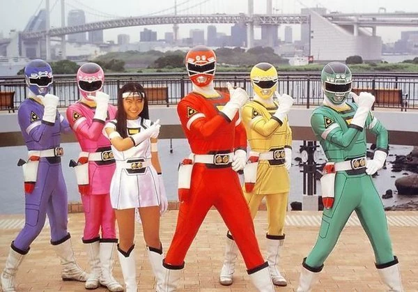
Chikyuu Sentai Fiveman:
The big Vs going across the torso look pretty cool and without them the design might be a little too simple. The yellow highlights work well on all five suits. Its also really rare to see them on a yellow suit as normally they'd be replaced with black so they can be seen more easily. The helmets look nice and I like each one has its own emblem on the forehead. The white stripes going down the middle looks good alongside their respective colors. Its a nice touch and it keeps the helmets from simply being one solid color. Red's has a nice little extra bit of flair since his stripe enters the visor of his helmet. It even ends in a little arrow that matches the shape of his visor. I like the segmented visors but I kinda think they went overboard on Yellow and Pink's. They don't look bad per say, more so that they are segmented in a way that looks unnatural given with the visors' shapes. The yellow bands looks good on the white gloves and boots. Overall while not one of the first designs I think of when it comes to this decade, its a perfectly fine design.
Chojin Sentai Jetman:
The bird insignia on the chest looks pretty cool and I love how it wraps around the shoulders. The helmets on all 5 suits look pretty cool and they get the bird motif across really well. They also sort of complete the bird insignia on the chest. The silver mouthpieces look alright on each helmet. The yellow highlights on every Jetman besides Yellow Owl look pretty good with all their main colors. In Yellow Owl's case the highlights are black and they were rather well with the his color. Blue Swallow marks the first time that this shade of blue has been used and it works well with her overall design. The white portions of the suits work well for the ones that they're on. I think they look pretty good and compliment their main colors rather well. I think they look the best on Blue Swallow as there is just something about how that shade of blue mixes with the white and the accompanying yellow highlights. Its probably because its a nice light shade of blue as opposed to all the standard blues the franchise has had before now. It makes the suit feel like it has this sort of shimmer to it. Due to white being her main color, the bits on White Swan's chest and legs are pink instead. The bird emblem on the belts is the icing on top of these designs. Overall these suits are one of my favorites of this decade and Blue Swallow is probably my fav design on this team.
Kyoryu Sentai Zyuranger:
They're rather simple but pretty distinct. The white diamond pattern on the main five's chests looks pretty good. The diamond patterns on their boots and gloves are a nice contrast to that since its in their main colors. The white trim on PteraRanger's skirt is a nice touch.The Dino Bucklers on the belts really ties the main five's suits together. The sculpting on all six helmets is great and there is a nice amount of detail on them. I particularly like the sculpting on MammothRanger's trunk/tusks and TigerRanger's fangs. MammothRanger's trunk even goes into his visor. PteraRanger's helmet looks nice thanks to the mixture of white and pink. Most of her helmet is actually white and I love it because it give the pink portion a sort domino mask or faceplate-esque look. Her Pteradon head even extends down into her visor. Its notable because unlike PteraRanger and MammothRanger, the other four's visors are the mouths of their dinosaurs. DragonRanger's suit looks cool. Its a tweaked Zyuranger suit obviously which is to be expected because its a sixth ranger suit after all. His gloves and boots have gold bands on them and a spike pattern instead of a diamond pattern. The chestplate looks cool and the center replicates the diamond that the other Zyuranger's have. The gold on the suit makes the green pop really well and the gold Dino Buckler brings his look together.
Gosei Sentai Dairanger:
The helmets get their mythical beasts across nicely. All six stand out pretty well and I think my favorite helmet might be RyuRanger's due to how well the black on the forehead works with the gold and red. The silver mouthplates look cool and each one has a slightly different design. I think HououRanger's mouthplate looks the best and works with her phoenix motif since it resembles a bird's beak. The white torso on the main five's suits balance out their colors really well. It really captures the martial artist look and gives the suits a very classic vibe. The white bands with gold outlines on the boots and gloves look cool and that color combo really makes their main colors pop. The gold trim on HououRanger's skirt is a nice touch. I particularly like the Dairanger emblem because of how well it uses all 5's colors and its neat that it looks a little bit like a fist. Kibaranger's suit is cool cuz its just a Dairanger suit with a chestplate added. The gold and black works well on the chestplate and I like the emblem in the center but I do think its a little too big. The gold bands on the boots and gloves being outlined in black looks pretty good and all the gold in his suit in general really makes the white pop.
Ninja Sentai Kakuranger:
The suits look exactly how you'd expect a ninja team to look. They're pretty much a perfect example of the "less is more" approach and there is a lot of beauty in that. The gold headbands look pretty cool on all 5 suits and each one has a different symbol on it. The gold belts on Red, Blue, Black, and White work well with their colors. NinjaBlue is a nice light shade of blue which is interesting as its the only time that I know of that a male blue ranger has used that shade. Yellow and Black's suits probably make the best use of the black and white bands on the gloves and boots out of the whole team. For Yellow, its probably because the bands match his belt and it completes his look rather well. The V's on the torso work well to break up the simple design. The black around the necks is a nice touch and I especially like that the tips of the V's are gold (well black in Yellow's case).
Choriki Sentai Ohranger:
The suits have this ancient vibe to them. The helmets look alright and the visors on the main five look good outlined in white. The sculpted mouth-pieces matching each one's respective colors is cool and it kind of reminds me of those Easter Island statues. The weathered gold on the main five's torsos looks pretty good and there is quite a lot of detail on that portion. It looks almost like its engraved metal even tho its still spandex. The gold bands compliment the white gloves and boots rather well as does the white neckline on the torso. The gold trim on Pink and Yellow's skirts is a nice touch. KingRanger's suit looks the best to me, mostly cuz its an Ohranger suit with extra gold armor added to it. The sculpting on his chestplate is great and there is some nice detail in there. His visor looks good outlined in gold. The white gloves and boots really compliment the black spandex and gold armor. The gold belts on all 6 suits look pretty cool and even include all of their shape symbols.
Gekisou Sentai Carranger:
Ignore White Racer for the moment as I couldn't find a decent looking pic without her and hers isn't really a suit per say. These suits look pretty stellar and I love the car panel designs going down the sides. The helmets capture the car motif pretty well and the chrome molding around the visors looks amazing. The helmets even have headlights on them and I just find that to be really cool touch on top of the chrome molding. The sculpted silver mouth pieces look pretty cool when paired with the chrome molding and they look like they're almost sunken into the helmets. The yellow around the neck and on the chest pairs well with the black surrounding them. The black bands on the gloves and boots look good and contrasts nicely with the white. I like that the Carranger emblem is a patch on the arms as opposed to a patch on the chest as it doesn't distract from the rest of the torsos' design. The headlight belt buckle really ties these suits together nicely.
Denji Sentai Megaranger:
These suits are pretty sleek and stylish while being just simple enough. The white on the main five suits helps their main colors pop really well and the white gloves and boots look cool. The yellow around the neck is interesting as you don't usually see that on a team with a Yellow on it. The main five's suits also have little squares going across the white stripe on the chest that match all five of their colors. Its a rather neat detail and it looks better than it would to have them all simply incorporated into an emblem. The white highlights on the main five's helmets work well with their colors and look pretty cool with the silver mouthplates. This Sentai marks the first introduction of a Silver. The gold highlights on the suit look great alongside the silver. His suit includes gold bands that look pretty good alongside his gloves and boots. The green squares look pretty good on the gold stripe going across his chest and if you look closer, they have this sort of wire-frame pattern on them. Its a rather cool and fitting small detail since in-show the suit is a prototype. The glass domes on all six helmets look pretty cool and make them look hi-tech. The domes can actually light up as well which is a really cool touch. The Megaranger emblem on the helmets and belts is a neat detail and it helps bring the overall look together.
Seijuu Sentai Gingaman:
The sculpting on all 5 helmets looks pretty cool and they show off their animals rather well. GingaRed's helmet has these cool looking yellow streaks to match GingaLion's mane. Its a nice touch and it looks pretty good with the red. The silver portions on the other four's helmets look pretty good and the silver works well with their colors. The animal eyes on top of the visors is a nice touch and they make the visors look like wide open animal mouths. The silver mouthpieces look pretty good and the way they're sculpted gives the helmets this tribal war mask vibe. The tribal pattern on the chest, arms, and boots looks pretty good. These suits have the best color balancing I've seen so far. The white portions of the suits are used in a way that perfectly balances out their main colors without overpowering them. Other suits so far have done that too but its more noticeable on these suits for me. The white portion on the chest look like tunics which fits pretty well with the tribal aesthetic. The black tribal patterns really make all 5 colors pop. Overall, its a pretty stellar look.
Kyuukyuu Sentai GogoV:
These look pretty dynamic while being rather sleek and streamlined. The white portions on the torso look cool and work well with their main colors. They also really make all 5 colors pop. None of the colors on any suit overpower the others. I like how their visors are each shaped like a badge belonging to each sibling's profession. Yellow's visor actually makes his helmet look a little slimmer than the others. Maybe its because the visor is kind of square-ish and the bottom corners lineup with where it slopes into the jawline. The gold belt looks good and a nice small detail is that the team's emblem isn't just on the belt, its also on the gloves and boots. The emblem being blue really compliments the gold surrounding it. The gold bands look pretty good paired with the white gloves and boots.
Man this decade sure loved gold highlights/accents. Half of the suits in this decade have them in some capacity. If I had to pick my favorite suits out of this decade, it'd be either Jetman or Dairanger. With that being said, I think Carranger has the best helmets this decade. Overall, its another pretty solid decade for Sentai designs. You may have noticed Ninjaman, Signalman, Hyuuga, and a few others are missing, I'll be covering those and any others that I miss in this series in a later post once I'm caught up to the present.
This is a blog for the podcast called Toku Warriors where the members of the podcast write down what is on their mind when we aren't podcasting. I hope you enjoy and please subscribe, like, and follow our related pages
Tuesday, June 2, 2020
Tuesday, December 17, 2019
Sentai Suits Through The Ages: The 80's
Now we make our way into the 80's. I forgot to mention this in the 70's post but a good chunk of the early Sentai suits were made of cloth, not spandex. So this decade is notable for a change in material even though early seasons in this decade still used cloth.
Denzi Sentai Denjiman:
These suits have a somewhat simple design and the white stripes across the torso help break it up a bit. The big D on the belt looks good as does the D on the chest. The white gloves and boots work well with all 5 colors as do the bands on them. The sculpted mouth-pieces look a bit rough to me but it helps with the team's distinct look so its fine. The glass covered circuitry, lights, and wiring in the helmets is a nice touch and it gives them a nice sci-fi/alien vibe. In addition to the visors being different shapes, the glass coverings are also different shapes so it adds some extra variety to the helmets. The yellow highlights on DenjiRed's helmet work well with the red. A nice little detail is that the belts includes their initials on the buckles. The scarves are also a really nice touch to have on Sentai suits in general.
Taiyo Sentai Sun Vulcan:
The suits look alright and I like the sun emblem on the chest. The white Vs on the chest looks pretty good and help break up the colors a bit. The helmets are the highlights of these designs imo as there is some nice detail on the animal designs. The shark on VulShark's helmet has gills and molded teeth. The yellow on VulEagle's helmet works well with the red. The silver mouth-pieces on the helmets look pretty good and add that little bit extra to the suits. I think it probably works best on VulEagle since the silver is flanked by the yellow. The colored Vs on the gloves and boots work well with the white on them. Also these suits have scarves which are just a cool touch in general that I want the franchise to bring them back.
Dai Sentai GoggleV:
The helmets look a bit too big for the suits to me but that might be due to the molding around the visor combined with the size of the silver mouth-pieces. The molding is gold on Red and Black and it works well with their colors. It also has this aged metal look to it which is a really nice touch. However, its silver on Blue, Yellow, and Pink and it works well with those three colors though I think it works slightly better on Blue and Yellow. The sculpted mouth-pieces look good though a bit too big but that is probably because they extend to the entire bottom jaw. It adds an extra bit of cool to them tho. The gems in their foreheads help add to the ancient relic vibe. The white on the chests works well with all 5 colors and the gold buckles on the belts work well. The gold emblem on the chest looks pretty good too and works well with the white chest. I like how the white gloves are broken up with a stripe matching each one's colors. The scarves on the suits are a nice touch but after how much I've gushed about scarves the last few times they've shown up, you probably knew I'd say that.
Kagaku Sentai Dynaman:
Two things to note right off the bat are the material and motif. This was the first Sentai to have spandex suits as they were made of cloth until this team. As for the motif, its probably well known by now but this was originally supposed to be a baseball themed team and you can tell. From the helmets to the torso to the lines down the legs, this sort of screams baseball Sentai. The white pants works perfectly with their colors and makes them really pop. The boots and gloves matching their main colors are a nice touch and I'm always glad to see Sentai suits doing this. The gold/yellow highlights on Red, Blue, and Pink work well with their colors. DynaYellow has all his gold highlights replaced with black and it helps make the yellow stand out a lot. The red highlights on DynaBlack look pretty good with the black on his suit. The gold on the helmets looks good with all five's colors and the silver mouth-pieces look good. Its a pretty solid design and a great first outing for the change to spandex.
Choudenshi Bioman:
The overall design is pretty simple and sleek but still unforgettable. They have this nice alien look about them while also looking pretty hi-tech. The circuit board going across the chest is a nice touch. The white compliments all 5 colors really well and makes the colors stand out more. The expanded white portions on the legs of Pink and Yellow makes them look a bit like they're some kind of wearing leggings on their suits. The helmets have super computer lights going through them and they can actually light up via practical effects. Its a nice touch and it feels like a step up from Denjiman's helmets. The panels on each helmet look great and the silver works well on each helmet. The silver headband look on top of the visors looks pretty good with the silver mouth-pieces. The Bioman emblem looks great in the belts and the gold contrasts well with the black on the belt. The silver bands wrapping around the white gloves and boots looks pretty good.
Dengeki Sentai Changeman:
These suits look pretty good. The yellow highlights on Red, Blue, and Black's helmets look pretty good and helps the colors pop. The pink highlights look pretty cool on Change Mermaid and really compliments the gold on her arms, belt, and boots. The white highlights on Change Phoenix's helmet look pretty good and compliment her color really well. The gold belts and bands look pretty good with all 5. Though I'd say it probably works the best on Change Mermaid for reasons mentioned earlier in this section. The white chest on all of them makes me think body armor and the emblems on all 5 helmets look pretty cool. The emblem on the chests looks pretty nice and I like how it shows off all 5's colors. Also the white portion of the emblem doesn't break up the symmetry of the chest design since its angled right where the corner of the design would be.
Choushinsei Flashman:
These suits are downright beautiful. It was discussing these suits with friends that actually made me want to do this series of posts. Whoever designed these suits got them perfect. They sell the sci-fi vibe really well. They're all pretty sleek looking and stylish. Each one's signature color works really well with the white portions and the black stripes going down the sides makes them pop, especially on the female suits. The helmets look nice and space-y and the prisms on them are a nice touch.I especially love the way the visor's open up. The silver mouth pieces look good with the white sides of the helmet and each one's main color. The colored bands next to the white gloves and boots look pretty cool. The bands above the boots look the best on Pink and Yellow due to the white leggings and the previously mentioned black stripe going down the sides. The suits manage to look both retro and futuristic at the same time so its a pretty timeless design imo. They are without a doubt my favorite suits out of this decade and some of my favorite suits in the franchise.
Hikari Sentai Maskman:
These are probably my second favorite suits from this decade. These designs are just straight up classic. They're pretty sleek and stream-lined and the big 5 logo looks cool. The white on the suits works well with all their colors and makes them pop. The white gloves look cool with the colored guards on the back. Its a detail I kinda wish Sentai would bring back. The white streaks down the boots look pretty good. In place of a belt, these suits have a white stripe between the torso and legs and it complements the overall design really well. The helmets look great with the white highlights and I love the earrings on Pink and Yellow. The earrings are a small detail you likely wouldn't notice outside of close-ups but when you do notice them, it makes Yellow and Pink's designs look even better. If I had to pick between the helmets, I'd say Red Mask's helmet is probably best because of how the white highlights are aligned.
Choujuu Sentai Liveman:
The helmets look fantastic and they capture each animal nicely. I particularly like the molded fangs on Yellow Lion and the horns on Green Sai. The white on all 5 helmets were makes their colors pop and the yellow beak on Red Falcon's helmet looks pretty good. I adore the silver mouth-pieces. The animals on each suit look great inside the giant white Vs. The white pants and sleeves help balance out their colors nicely and the blue trim on Blue Dolphin's skirt is a nice touch. The silver bands on the colored gloves and boots compliment all of their colors pretty well. The silver belts with the colored jewels in the middle look pretty good and work well with the rest of the suits.
Kousoku Sentai Turboranger:
The white going down their chests works well with all 5 colors. The yellow highlights around the chests of Blue, Pink, Red, and Black looks good and works well with their colors. However, I think the black highlights on Yellow's chest look the best. The emblem on the chest looks pretty good and it helps sell the car motif since its basically an engine. The helmets capture the car motif rather well and the silver highlights look pretty good on all 5 helmets. The silver mouthpiece looks pretty good with the helmets and as you can tell from previous sections, its shown up quite a lot during this era of Sentai. The gold bands on the gloves and boots look pretty good on all 5 suits but they are a little hard to see on Yellow's. They look pretty cool overall and are a nice way to close out this decade of suit designs.
This era of Sentai probably resulted in some of the most memorable designs in the franchise. Flashman, Liveman, and Maskman are probably the standout designs of this era. Denjiman and Sun Vulcan are alright overall despite being kinda simple and they still do have notable features to them. They feel a little like a hold-over from the 70s to me. Overall, the 80s are pretty strong decade as far as the designs go.
Denzi Sentai Denjiman:
These suits have a somewhat simple design and the white stripes across the torso help break it up a bit. The big D on the belt looks good as does the D on the chest. The white gloves and boots work well with all 5 colors as do the bands on them. The sculpted mouth-pieces look a bit rough to me but it helps with the team's distinct look so its fine. The glass covered circuitry, lights, and wiring in the helmets is a nice touch and it gives them a nice sci-fi/alien vibe. In addition to the visors being different shapes, the glass coverings are also different shapes so it adds some extra variety to the helmets. The yellow highlights on DenjiRed's helmet work well with the red. A nice little detail is that the belts includes their initials on the buckles. The scarves are also a really nice touch to have on Sentai suits in general.
Taiyo Sentai Sun Vulcan:
The suits look alright and I like the sun emblem on the chest. The white Vs on the chest looks pretty good and help break up the colors a bit. The helmets are the highlights of these designs imo as there is some nice detail on the animal designs. The shark on VulShark's helmet has gills and molded teeth. The yellow on VulEagle's helmet works well with the red. The silver mouth-pieces on the helmets look pretty good and add that little bit extra to the suits. I think it probably works best on VulEagle since the silver is flanked by the yellow. The colored Vs on the gloves and boots work well with the white on them. Also these suits have scarves which are just a cool touch in general that I want the franchise to bring them back.
Dai Sentai GoggleV:
The helmets look a bit too big for the suits to me but that might be due to the molding around the visor combined with the size of the silver mouth-pieces. The molding is gold on Red and Black and it works well with their colors. It also has this aged metal look to it which is a really nice touch. However, its silver on Blue, Yellow, and Pink and it works well with those three colors though I think it works slightly better on Blue and Yellow. The sculpted mouth-pieces look good though a bit too big but that is probably because they extend to the entire bottom jaw. It adds an extra bit of cool to them tho. The gems in their foreheads help add to the ancient relic vibe. The white on the chests works well with all 5 colors and the gold buckles on the belts work well. The gold emblem on the chest looks pretty good too and works well with the white chest. I like how the white gloves are broken up with a stripe matching each one's colors. The scarves on the suits are a nice touch but after how much I've gushed about scarves the last few times they've shown up, you probably knew I'd say that.
Kagaku Sentai Dynaman:
Two things to note right off the bat are the material and motif. This was the first Sentai to have spandex suits as they were made of cloth until this team. As for the motif, its probably well known by now but this was originally supposed to be a baseball themed team and you can tell. From the helmets to the torso to the lines down the legs, this sort of screams baseball Sentai. The white pants works perfectly with their colors and makes them really pop. The boots and gloves matching their main colors are a nice touch and I'm always glad to see Sentai suits doing this. The gold/yellow highlights on Red, Blue, and Pink work well with their colors. DynaYellow has all his gold highlights replaced with black and it helps make the yellow stand out a lot. The red highlights on DynaBlack look pretty good with the black on his suit. The gold on the helmets looks good with all five's colors and the silver mouth-pieces look good. Its a pretty solid design and a great first outing for the change to spandex.
Choudenshi Bioman:
The overall design is pretty simple and sleek but still unforgettable. They have this nice alien look about them while also looking pretty hi-tech. The circuit board going across the chest is a nice touch. The white compliments all 5 colors really well and makes the colors stand out more. The expanded white portions on the legs of Pink and Yellow makes them look a bit like they're some kind of wearing leggings on their suits. The helmets have super computer lights going through them and they can actually light up via practical effects. Its a nice touch and it feels like a step up from Denjiman's helmets. The panels on each helmet look great and the silver works well on each helmet. The silver headband look on top of the visors looks pretty good with the silver mouth-pieces. The Bioman emblem looks great in the belts and the gold contrasts well with the black on the belt. The silver bands wrapping around the white gloves and boots looks pretty good.
Dengeki Sentai Changeman:
These suits look pretty good. The yellow highlights on Red, Blue, and Black's helmets look pretty good and helps the colors pop. The pink highlights look pretty cool on Change Mermaid and really compliments the gold on her arms, belt, and boots. The white highlights on Change Phoenix's helmet look pretty good and compliment her color really well. The gold belts and bands look pretty good with all 5. Though I'd say it probably works the best on Change Mermaid for reasons mentioned earlier in this section. The white chest on all of them makes me think body armor and the emblems on all 5 helmets look pretty cool. The emblem on the chests looks pretty nice and I like how it shows off all 5's colors. Also the white portion of the emblem doesn't break up the symmetry of the chest design since its angled right where the corner of the design would be.
Choushinsei Flashman:
These suits are downright beautiful. It was discussing these suits with friends that actually made me want to do this series of posts. Whoever designed these suits got them perfect. They sell the sci-fi vibe really well. They're all pretty sleek looking and stylish. Each one's signature color works really well with the white portions and the black stripes going down the sides makes them pop, especially on the female suits. The helmets look nice and space-y and the prisms on them are a nice touch.I especially love the way the visor's open up. The silver mouth pieces look good with the white sides of the helmet and each one's main color. The colored bands next to the white gloves and boots look pretty cool. The bands above the boots look the best on Pink and Yellow due to the white leggings and the previously mentioned black stripe going down the sides. The suits manage to look both retro and futuristic at the same time so its a pretty timeless design imo. They are without a doubt my favorite suits out of this decade and some of my favorite suits in the franchise.
Hikari Sentai Maskman:
These are probably my second favorite suits from this decade. These designs are just straight up classic. They're pretty sleek and stream-lined and the big 5 logo looks cool. The white on the suits works well with all their colors and makes them pop. The white gloves look cool with the colored guards on the back. Its a detail I kinda wish Sentai would bring back. The white streaks down the boots look pretty good. In place of a belt, these suits have a white stripe between the torso and legs and it complements the overall design really well. The helmets look great with the white highlights and I love the earrings on Pink and Yellow. The earrings are a small detail you likely wouldn't notice outside of close-ups but when you do notice them, it makes Yellow and Pink's designs look even better. If I had to pick between the helmets, I'd say Red Mask's helmet is probably best because of how the white highlights are aligned.
Choujuu Sentai Liveman:
The helmets look fantastic and they capture each animal nicely. I particularly like the molded fangs on Yellow Lion and the horns on Green Sai. The white on all 5 helmets were makes their colors pop and the yellow beak on Red Falcon's helmet looks pretty good. I adore the silver mouth-pieces. The animals on each suit look great inside the giant white Vs. The white pants and sleeves help balance out their colors nicely and the blue trim on Blue Dolphin's skirt is a nice touch. The silver bands on the colored gloves and boots compliment all of their colors pretty well. The silver belts with the colored jewels in the middle look pretty good and work well with the rest of the suits.
Kousoku Sentai Turboranger:
The white going down their chests works well with all 5 colors. The yellow highlights around the chests of Blue, Pink, Red, and Black looks good and works well with their colors. However, I think the black highlights on Yellow's chest look the best. The emblem on the chest looks pretty good and it helps sell the car motif since its basically an engine. The helmets capture the car motif rather well and the silver highlights look pretty good on all 5 helmets. The silver mouthpiece looks pretty good with the helmets and as you can tell from previous sections, its shown up quite a lot during this era of Sentai. The gold bands on the gloves and boots look pretty good on all 5 suits but they are a little hard to see on Yellow's. They look pretty cool overall and are a nice way to close out this decade of suit designs.
This era of Sentai probably resulted in some of the most memorable designs in the franchise. Flashman, Liveman, and Maskman are probably the standout designs of this era. Denjiman and Sun Vulcan are alright overall despite being kinda simple and they still do have notable features to them. They feel a little like a hold-over from the 70s to me. Overall, the 80s are pretty strong decade as far as the designs go.
Monday, November 18, 2019
Sentai Suits Through The Ages: The 70's
Super Sentai has had a vast number of suits for its heroes. Naturally these suits have changed in style, vibe, and even material throughout the years. I figured a post like this would be a good way to show how much the franchise has changed over the years as far as aesthetics go. What I'm basically going to do for this series of posts is cover every Sentai team's suits by the decades they aired and each decade will have its own post. Due to this, this post is gonna be the shortest since only 3 Sentai series aired in the 70's.
Himitsu Sentai Gorenger:
The first sentai suits ever. They're rather simple overall but they work well. The markings on the chest and the white stripes do a decent job of breaking up the design and keep it from looking too simple. The belts look pretty good. That white gloves and boots work well on Akaranger and Momoranger and compliment their main colors really well. The black ones on Midoranger, Kiranger, and Aoranger work well with their colors as well. The capes are a really nice touch and we need more of those in the franchise. I could picture the suits without them but capes in general on superhero outfits add extra flourishes with how they react to movements so I'm glad they're there.
JAKQ Dengekitai:
These suits look pretty good. The visors help show off the card motif. The white on the four suits works well with their colors. The gloves matching their main colors is a nice touch and they help balance out the white on the helmets in Dia Jack, Clover King, and Heart Queen's cases. The sash going down the front helps break up what would be a simple design. The belts look pretty cool. Big One's suit is pretty good too. The red, blue, green, and yellow going down the helmet, wrapping around the arms and legs, and going down the chest adds a nice bit of color diversity to the suit. It also helps break up all the white which was kinda needed imo. The red belt buckle looks cool. Plus all 5 suits have capes and capes will never not be cool to me. Like with Gorenger, I can picture the suits without them but they're a good add-on that adds more style to their movements.
Battle Fever J:
These helmets look fantastic and because of the way they're molded they look more like western superhero masks and cowls as opposed to simply being helmets. The white on Battle Japan, Battle France, and Miss America works well with their colors. I particularly love the gymnast look Miss America has and how her helmet has sculpted hair. The green on Battle Kenya really compliments the black on the suit and the yellow on his helmet and his emblem works well with his red eyes. The black on Battle Cossack really compliments the orange and the black highlights on the helmet work well with the red eyes. The scarves on each suit really completes their design and brings everything together. Overall these are my favorite suits from this decade and probably some of the best suits the franchise has ever used.
If I had to pick a phrase that described Gorenger and JAKQ's designs overall, it'd be simple yet effective. If there is one big takeaway I have from Gorenger and JAKQ's designs, its that we need more capes in Sentai. Battle Fever J is the clear standout of this decade and like capes, scarves need to make a comeback in the franchise. The 70's are a good start for the franchise as far as designs go. Next up I will probably cover the 80's tho I make no promises on when that will come out.
Himitsu Sentai Gorenger:
The first sentai suits ever. They're rather simple overall but they work well. The markings on the chest and the white stripes do a decent job of breaking up the design and keep it from looking too simple. The belts look pretty good. That white gloves and boots work well on Akaranger and Momoranger and compliment their main colors really well. The black ones on Midoranger, Kiranger, and Aoranger work well with their colors as well. The capes are a really nice touch and we need more of those in the franchise. I could picture the suits without them but capes in general on superhero outfits add extra flourishes with how they react to movements so I'm glad they're there.
JAKQ Dengekitai:
These suits look pretty good. The visors help show off the card motif. The white on the four suits works well with their colors. The gloves matching their main colors is a nice touch and they help balance out the white on the helmets in Dia Jack, Clover King, and Heart Queen's cases. The sash going down the front helps break up what would be a simple design. The belts look pretty cool. Big One's suit is pretty good too. The red, blue, green, and yellow going down the helmet, wrapping around the arms and legs, and going down the chest adds a nice bit of color diversity to the suit. It also helps break up all the white which was kinda needed imo. The red belt buckle looks cool. Plus all 5 suits have capes and capes will never not be cool to me. Like with Gorenger, I can picture the suits without them but they're a good add-on that adds more style to their movements.
Battle Fever J:
These helmets look fantastic and because of the way they're molded they look more like western superhero masks and cowls as opposed to simply being helmets. The white on Battle Japan, Battle France, and Miss America works well with their colors. I particularly love the gymnast look Miss America has and how her helmet has sculpted hair. The green on Battle Kenya really compliments the black on the suit and the yellow on his helmet and his emblem works well with his red eyes. The black on Battle Cossack really compliments the orange and the black highlights on the helmet work well with the red eyes. The scarves on each suit really completes their design and brings everything together. Overall these are my favorite suits from this decade and probably some of the best suits the franchise has ever used.
If I had to pick a phrase that described Gorenger and JAKQ's designs overall, it'd be simple yet effective. If there is one big takeaway I have from Gorenger and JAKQ's designs, its that we need more capes in Sentai. Battle Fever J is the clear standout of this decade and like capes, scarves need to make a comeback in the franchise. The 70's are a good start for the franchise as far as designs go. Next up I will probably cover the 80's tho I make no promises on when that will come out.
Wednesday, November 6, 2019
My Thoughts On Every Pokemon Generation So Far
What can I say to start off other than...its Pokemon? Its something that doesn't need an intro since its so big in the mainstream and in nerd circles. Its a pop culture juggernaut at this point. I've been thinking about all the pokemon games I've played over the years so I thought "Hey, why not give my thoughts on each gen?". So enough stalling, lets get down to business.
Gen 1:
I get this game has a lot of nostalgia value for people and its a really fun game. However, it is also a really broken game. Psychic types are outright broken in these games because bug and ghost are practically useless against them despite being its weaknesses. You're in a for a rough time unless you one-shot them. Even Lance's Dragonites are easier to beat than Sabrina's gym for me. Its broken-ness is understandable since its literally the base for the rest of the franchise. There unfortunately isn't much I can say for the story as its just the player taking on Team Rocket. That being said, its probably my least favorite Gen in the franchise if only for the fact that its the starting point for everything. I much preferred the remakes to the originals.
Gen 2:
The 2nd games in the franchise. This Gen had a lot of improvements over Gen 1. Its better balanced and just as fun. It introduced held items, male/female pokemon, and breeding. It also introduced steel types and a type specifically created to take down psychic types: Dark. This Gen also brought back Team Rocket for the player to finish off. The only frustrating gym in this game is Whitney's. I don't need to say why because its become a meme in the fandom. This was actually the first Gen I played since I got Gold version and Blue version at the same time. Sadly I have never had the chance to play Crystal so I have no idea what thats like. Overall, its a fun gen that built up on what Gen 1 started.
Gen 3:
I have sadly not played Emerald so I'll just be commenting on Ruby and Sapphire. This is honestly were I think the games hit their stride as they add so many things to the franchise. The story is great and there is so much to do. I maxed out my playtime in these games. The contests are by far my fav side-content in the entire franchise. So many new pokemon were added in this Gen and all of them were pretty fun to use. I love Team Aqua and Magma simply because they didn't want to take over the world or just make money. They wanted to improve the world for pokemon and it lead to some really dangerous consequences. Its a nice lesson about not considering the consequences of what you're doing. With that being said, I do find the lore around Kyogre and Groudon kind of lacking. For the most part we just hear a bit about their battle and thats all.
Gen 4:
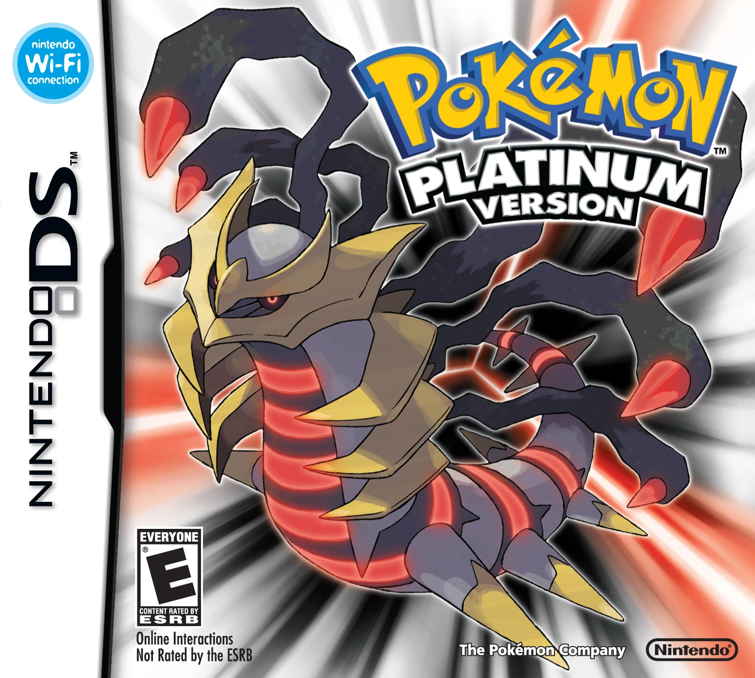
This Gen is pretty fun. I like the lore and world building as well as the duality of Time and Space between the main legendaries. Cyrus' plan is pretty good especially when you consider that in Diamond and Pearl, he technically wins. The dude actually creates his own universe. The underground is pretty fun and its a really good piece of side content. Platinum is the more complete version that throws Giratina into the mix while expanding the lore of Sinnoh. Platinum is a nice challenge. It was so difficult that on my first two play-throughs, I couldn't get past the bug Elite's Yanmega even with level and type advantage. This thing has haunted my dreams for years. I managed to beat it on my 3rd play-through. However, my main gripe with Gen 4 overall is the Contests. They're way too complicated so I never bothered doing them much. This Gen is also the biggest offender for making you have to use HMs just to get around.
Gen 5:
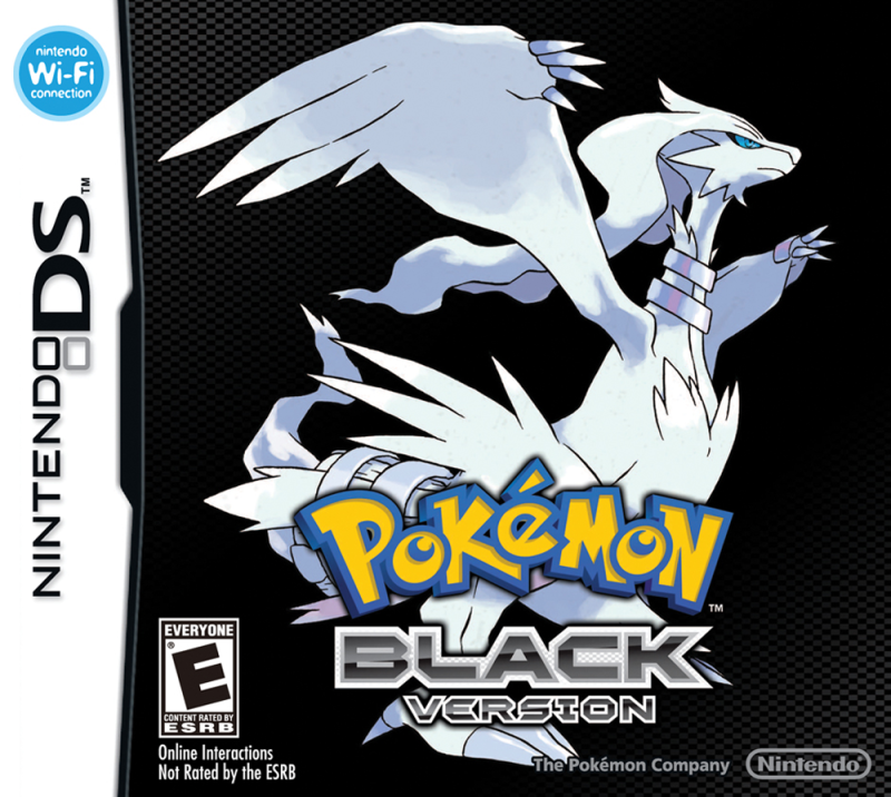
Gen 5 was ok. The story is fine and I like the variety of Unova's pokemon. The world building with the legendaries was neat and its got some neat lore. I like N as a villain because he legitimately just wants to help pokemon and he is genuinely upset when he finds out the true villain of the game was using him. This Gen was the first to let you fight the Elite 4 in any order you wanted. Honestly, I loved it because it allowed me to test each of them out to make sure I could beat them. If I had a little too much trouble, I'd reset and try taking on a different member. Black and White 2 picks up where the first games left off. It was great to see what the rivals and N were up to. The side-content in all 4 games is ok though I still have not been able to work out what the musicals even do.
Gen 6:
I'm going to be honest, this is my least favorite Gen in the franchise. Sure its a nice graphics upgrade and it made EV training incredibly easy so there are a few pluses to the game. Character customization was also a really good idea. What costs it points with me is simply this: Once you beat the League, there is virtually nothing to do outside the Looker missions. I'm not a competitive player so I really don't care for Super Training. There also aren't many new pokemon so I tended to just use the older ones alongside my Delphox because that was what I was familiar with. Adding fairy types as potential dragon killers was a nice idea. However, thats kind of undercut by the fact that the game introduced a Poison/Dragon type at the same time. That made it the go-to for killing fairy types. The game in general feels unfinished and stripped down. It never expands on the lore after the League outside of fighting the giant guy thats implied to be the ancient king of Kalos.
Gen 7:
This Gen is a major step up from Gen 6. I played Sun and Ultra Sun so if there are any major differences between those and Moon/Ultra Moon, I wouldn't know. I love how Alola as a whole feels. Its the most alive any pokemon game so far has felt. The trials while annoying to some are a nice change of pace for me even if some of the totem pokemon are a pain. The thing I appreciate the most about Gen 7 however, is one simple thing: They finally removed the need for HMs. You have no idea how happy that made me. I was able to build the exact team I wanted and use it throughout the entire story. Admittedly, I do feel a a bit sad since no new pokemon appear Post-League so its kinda lacking in post game content. Its not as lacking as Gen 6 because what post game content thats there is fun. Its great that we get to fight the leaders of older teams.
So...what will Gen 8 hold? Who knows. All I know is I'm pretty excited for it. If I had to comment on the whole thing about most of the roster being cut...meh. I don't really care that most of the mons aren't available. I've treated just about every Gen as a fresh start for the franchise anyway. I'm more concerned what the story and side-content will be. I've tried to keep from seeing a lot of the news so I can go in blind but what I have heard about it has me pretty interested. Also, I will probably cover the remakes at some point in the future.
Gen 1:
I get this game has a lot of nostalgia value for people and its a really fun game. However, it is also a really broken game. Psychic types are outright broken in these games because bug and ghost are practically useless against them despite being its weaknesses. You're in a for a rough time unless you one-shot them. Even Lance's Dragonites are easier to beat than Sabrina's gym for me. Its broken-ness is understandable since its literally the base for the rest of the franchise. There unfortunately isn't much I can say for the story as its just the player taking on Team Rocket. That being said, its probably my least favorite Gen in the franchise if only for the fact that its the starting point for everything. I much preferred the remakes to the originals.
Gen 2:
The 2nd games in the franchise. This Gen had a lot of improvements over Gen 1. Its better balanced and just as fun. It introduced held items, male/female pokemon, and breeding. It also introduced steel types and a type specifically created to take down psychic types: Dark. This Gen also brought back Team Rocket for the player to finish off. The only frustrating gym in this game is Whitney's. I don't need to say why because its become a meme in the fandom. This was actually the first Gen I played since I got Gold version and Blue version at the same time. Sadly I have never had the chance to play Crystal so I have no idea what thats like. Overall, its a fun gen that built up on what Gen 1 started.
Gen 3:
I have sadly not played Emerald so I'll just be commenting on Ruby and Sapphire. This is honestly were I think the games hit their stride as they add so many things to the franchise. The story is great and there is so much to do. I maxed out my playtime in these games. The contests are by far my fav side-content in the entire franchise. So many new pokemon were added in this Gen and all of them were pretty fun to use. I love Team Aqua and Magma simply because they didn't want to take over the world or just make money. They wanted to improve the world for pokemon and it lead to some really dangerous consequences. Its a nice lesson about not considering the consequences of what you're doing. With that being said, I do find the lore around Kyogre and Groudon kind of lacking. For the most part we just hear a bit about their battle and thats all.
Gen 4:
This Gen is pretty fun. I like the lore and world building as well as the duality of Time and Space between the main legendaries. Cyrus' plan is pretty good especially when you consider that in Diamond and Pearl, he technically wins. The dude actually creates his own universe. The underground is pretty fun and its a really good piece of side content. Platinum is the more complete version that throws Giratina into the mix while expanding the lore of Sinnoh. Platinum is a nice challenge. It was so difficult that on my first two play-throughs, I couldn't get past the bug Elite's Yanmega even with level and type advantage. This thing has haunted my dreams for years. I managed to beat it on my 3rd play-through. However, my main gripe with Gen 4 overall is the Contests. They're way too complicated so I never bothered doing them much. This Gen is also the biggest offender for making you have to use HMs just to get around.
Gen 5:
Gen 5 was ok. The story is fine and I like the variety of Unova's pokemon. The world building with the legendaries was neat and its got some neat lore. I like N as a villain because he legitimately just wants to help pokemon and he is genuinely upset when he finds out the true villain of the game was using him. This Gen was the first to let you fight the Elite 4 in any order you wanted. Honestly, I loved it because it allowed me to test each of them out to make sure I could beat them. If I had a little too much trouble, I'd reset and try taking on a different member. Black and White 2 picks up where the first games left off. It was great to see what the rivals and N were up to. The side-content in all 4 games is ok though I still have not been able to work out what the musicals even do.
Gen 6:
I'm going to be honest, this is my least favorite Gen in the franchise. Sure its a nice graphics upgrade and it made EV training incredibly easy so there are a few pluses to the game. Character customization was also a really good idea. What costs it points with me is simply this: Once you beat the League, there is virtually nothing to do outside the Looker missions. I'm not a competitive player so I really don't care for Super Training. There also aren't many new pokemon so I tended to just use the older ones alongside my Delphox because that was what I was familiar with. Adding fairy types as potential dragon killers was a nice idea. However, thats kind of undercut by the fact that the game introduced a Poison/Dragon type at the same time. That made it the go-to for killing fairy types. The game in general feels unfinished and stripped down. It never expands on the lore after the League outside of fighting the giant guy thats implied to be the ancient king of Kalos.
Gen 7:
This Gen is a major step up from Gen 6. I played Sun and Ultra Sun so if there are any major differences between those and Moon/Ultra Moon, I wouldn't know. I love how Alola as a whole feels. Its the most alive any pokemon game so far has felt. The trials while annoying to some are a nice change of pace for me even if some of the totem pokemon are a pain. The thing I appreciate the most about Gen 7 however, is one simple thing: They finally removed the need for HMs. You have no idea how happy that made me. I was able to build the exact team I wanted and use it throughout the entire story. Admittedly, I do feel a a bit sad since no new pokemon appear Post-League so its kinda lacking in post game content. Its not as lacking as Gen 6 because what post game content thats there is fun. Its great that we get to fight the leaders of older teams.
So...what will Gen 8 hold? Who knows. All I know is I'm pretty excited for it. If I had to comment on the whole thing about most of the roster being cut...meh. I don't really care that most of the mons aren't available. I've treated just about every Gen as a fresh start for the franchise anyway. I'm more concerned what the story and side-content will be. I've tried to keep from seeing a lot of the news so I can go in blind but what I have heard about it has me pretty interested. Also, I will probably cover the remakes at some point in the future.
Thursday, October 31, 2019
Rosario Vampire Review
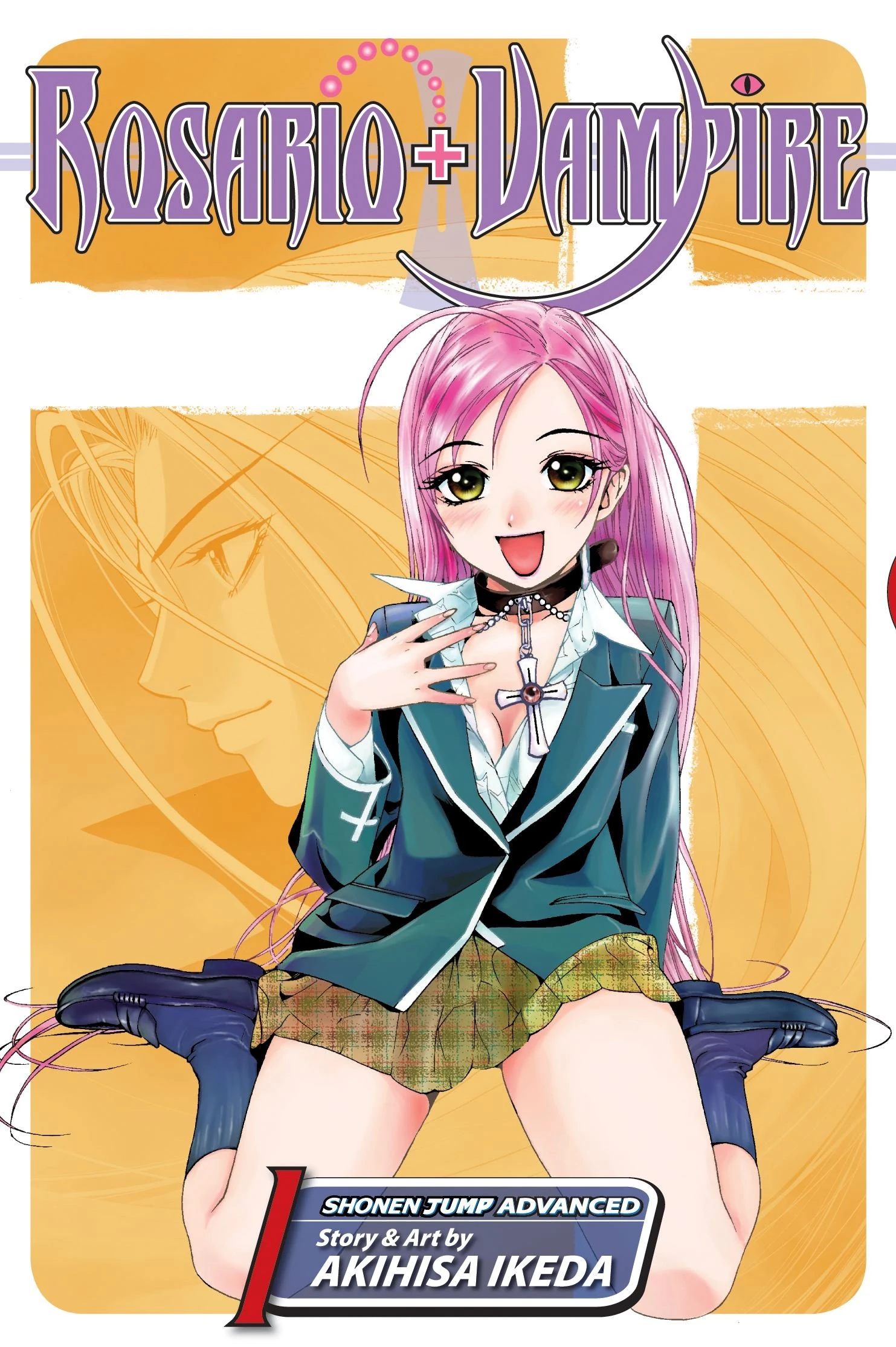
Just in time for Halloween, I finally got a hold of the final volume of the manga. I have thoroughly enjoyed this manga. Its a manga that I've been reading for nearly a decade. The manga is divided into two seasons.
Premise: Tsukune Anno is an utterly average student who couldn't get accepted into any high school...except for one he had never even heard of before, Yokai Academy. When he gets off the bus he finds himself in this strange, creepy world. Shortly afterwards, he runs into a fellow student named Moka, an upbeat cheerful girl who immediately bites his neck and gains a taste for his blood. Yeah this is no ordinary school, Tsukune has been accepted into a school for monsters. The school's purpose is to teach younger monster's how to operate in disguise in the human world so humans and monsters can coexist. What basically follows is Tsukune just trying to survive each day at the school while not letting anyone know he is human (outside of his friends) or he will be killed on the spot. That is the plot of season 1 of the manga.
Season 2 of the manga centers more around the introduction of an organization of monsters called Fairy Tale. They basically want monsters to take over the human world and slaughter humans. We also get a look at Mizore's hometown. However, the crux of season 2 centers around the importance of Moka's "rosario seal", her family, and the fate of her mother who Moka hadn't seen since she was a child. Its some fun stuff all around if a bit fast paced when the manga gets to it a couple volumes before the end.
Before talking about the characters, I want to talk about the manga's genre and how it handles a few of its tropes for a bit. Its bit of a weird mix for me. While its a shounen fighting manga that focuses on monsters slugging it out, it also has a harem aspect, and a bit of romance. The harem aspect feels a bit weird to me since well, the both manga and Tsukune pretty much admit that he only has eyes for Moka. The manga also doesn't take the harem aspect too seriously so it avoids some annoying tropes and they all come off as feeling like really good friends so it works well in that regard. I find it really interesting that despite being the protagonist of a shounen manga, Tsukune isn't actually able to do much himself for a chunk of the manga. Usually its Moka or a member of the female cast dealing the finishing blow. Tsukune gains a ghoul form thanks to Moka infusing him with a her blood to save his life after what would be mortal injuries a lot, then he becomes half-vampire, and only gains full on vampire powers in the final battle in season two of the manga. It feels like a nice natural, incremental power escalation which is weird for me to see in a shounen manga as he constantly has to adapt to things even when he gains enough power to stand on his own as he is usually out-classed even by his friends. The restrained power trope is actually applied to Moka for the most part. Her rosario basically sealed off her vampire powers allowing her to be raised in the human world.
Now for the characters, I like them. Tsukune is a neat protagonist. At first he freaks out a bit when he enrolls in the school but after meeting Moka and forming a group of friends, he starts wanting to create a world where humans and monsters can coexist. There are two Moka's thanks to her rosario seal: Inner Moka and Outer Moka. Outer Moka is the more bubbly and outgoing side of Moka's personality with occasional confidence issues. Inner Moka is her more powerful and confident side and she is the side of Moka that can access her vampiric strength. Kurumu is a succubus but she is rather naive about things and is focused purely on who she sees are her true love (Tsukune). Its a rather heartbreaking outcome for her as when she comes to the realize that Tsukune likely won't return her feelings, she has a breakdown and it actually affects her fighting ability for a bit. In the end, she sort of comes to peace with it but still vows not to give up trying to win his heart. Yukari is a young witch who I don't honestly view as being in love with Tsukune and I see it as a crush than anything. Mostly because a lot of times, she tries to help the others get closer to Tsukune (and attempts to help Tsukune get closer to Moka) as opposed to going after him herself. On top of that when Feng Feng gets introduced in season 2 of the manga, she has a lot more chemistry with him and the epilogue comic strip after the main epilogue sort of implies that they get together in the future. Mizore is a snow fairy and she is honestly my favorite character in the manga. Its mostly due to her motivation regarding how she feels about Tsukune. She loves Tsukune and wants to be with him as much as Kurumu does but she outright admits that even if he doesn't choose her, she just wants him to be happy and that will be enough for her. Something about her being willing to sacrifice her own happiness so he could be happy just stuck with me.
I'm splitting this section here because I consider these characters to be more secondary members of Tsukune's group of friends. These characters are Gin, Ruby, Koko, and Feng Feng. Gin is a werewolf with a rather pervy side to him. Pervy characters don't annoy me that much and Gin does have some redeeming qualities to him as he is rather loyal to his friends. Thats about all I can say for him as he gets one big moment in season 1 of the manga. After that, he kinda moves into the background and even disappears for a good chunk of the manga and I have no idea why, maybe Tsukune's group just got too big for the writer to know what to do with Gin. Ruby's introduction is fine. She was a witch taken in by another witch in the human world who hated humans for various reasons. After her introduction, she appears sporadically throughout the rest of season 1 of the manga. With that being said, the comedy around Ruby makes me cringe a bit. Its usually a joke about how she is a masochist and likes being hit. There is an entire chapter where she is training Tsukune where she keeps bringing that up and it kinda messes up the flow imo. With that being said, I do like how its used when she actually fights a member of Fairy Tale. It causes him to freak out because he is raining down lightning bolts on her and her only response is screams of ecstasy. Koko shows up in season 2 is Moka's younger sister with a chip on her shoulder as you'd expect since she views herself as being the weakest in her family. Mostly she is the weakest because after a certain age a vampire's powers and fighting ability increase exponentially and Koko hasn't hit that age yet. When she is introduced, she has a sort of obsession regards to wanting to beat Moka in a fight. That stops around the time Fairy Tale shows up and they have to focus on defeating them. Feng Feng shows up in season 2, shortly before the Fairy Tale stuff pops off. The dude is a yaksha but not a powerful one at the moment and he is the soon-to-be head of a chinese monster mafia family. The family's power has been waning lately so at first he tries to strong arm Tsukune into joining by telling the girls that the members of his family are allowed to have multiple wives. He has a few confidence issues regarding his abilities and I like the guy as a character. He also has some really good interactions with Yukari so I'm all for them ending up together in the future.
The ending is...perfectly fine for what it is. Its satisfying enough but it kinda leaves things open so it feels a bit incomplete. Before going on to an epilogue it legitimately says "But thats a story for another time" once massive shake-ups have happened as a result of the final battle. I dunno, it feels like a season 3 was supposed to happen but for whatever reason, the writer chose to end the manga there.
The manga includes little bite-sized encyclopedia entries every time a character transforms for the first time. These basically give you information such as what mythology that monster comes from and what basic powers they have. The artist also loved sneaking in little references here and there. Off the top of my head: The Pillar Men's stone mask from Jojo shows up for a sight gag, one of the background students' monster form is a Saibaman, and a guy dressed as Luffy shows up in he background of a beach shot. There are a lot more that I've forgotten to mention. The covers for the manga are really good and some of them have this almost painting like quality to them.
Overall, I enjoyed the manga. Unfortunately, I don't consider it good enough to be a must-read but I do recommend reading at least the 1st two volumes to see if its your kind of thing. With that said, its also out of print now so its going to be slightly more expensive. For me tho, I'm glad I took a gamble and started reading this manga so long ago. The characters are all like-able and the fight scenes are fun due to the variety of monsters they go up against so it doesn't get stale. It was worth my time.
Premise: Tsukune Anno is an utterly average student who couldn't get accepted into any high school...except for one he had never even heard of before, Yokai Academy. When he gets off the bus he finds himself in this strange, creepy world. Shortly afterwards, he runs into a fellow student named Moka, an upbeat cheerful girl who immediately bites his neck and gains a taste for his blood. Yeah this is no ordinary school, Tsukune has been accepted into a school for monsters. The school's purpose is to teach younger monster's how to operate in disguise in the human world so humans and monsters can coexist. What basically follows is Tsukune just trying to survive each day at the school while not letting anyone know he is human (outside of his friends) or he will be killed on the spot. That is the plot of season 1 of the manga.
Season 2 of the manga centers more around the introduction of an organization of monsters called Fairy Tale. They basically want monsters to take over the human world and slaughter humans. We also get a look at Mizore's hometown. However, the crux of season 2 centers around the importance of Moka's "rosario seal", her family, and the fate of her mother who Moka hadn't seen since she was a child. Its some fun stuff all around if a bit fast paced when the manga gets to it a couple volumes before the end.
Before talking about the characters, I want to talk about the manga's genre and how it handles a few of its tropes for a bit. Its bit of a weird mix for me. While its a shounen fighting manga that focuses on monsters slugging it out, it also has a harem aspect, and a bit of romance. The harem aspect feels a bit weird to me since well, the both manga and Tsukune pretty much admit that he only has eyes for Moka. The manga also doesn't take the harem aspect too seriously so it avoids some annoying tropes and they all come off as feeling like really good friends so it works well in that regard. I find it really interesting that despite being the protagonist of a shounen manga, Tsukune isn't actually able to do much himself for a chunk of the manga. Usually its Moka or a member of the female cast dealing the finishing blow. Tsukune gains a ghoul form thanks to Moka infusing him with a her blood to save his life after what would be mortal injuries a lot, then he becomes half-vampire, and only gains full on vampire powers in the final battle in season two of the manga. It feels like a nice natural, incremental power escalation which is weird for me to see in a shounen manga as he constantly has to adapt to things even when he gains enough power to stand on his own as he is usually out-classed even by his friends. The restrained power trope is actually applied to Moka for the most part. Her rosario basically sealed off her vampire powers allowing her to be raised in the human world.
Now for the characters, I like them. Tsukune is a neat protagonist. At first he freaks out a bit when he enrolls in the school but after meeting Moka and forming a group of friends, he starts wanting to create a world where humans and monsters can coexist. There are two Moka's thanks to her rosario seal: Inner Moka and Outer Moka. Outer Moka is the more bubbly and outgoing side of Moka's personality with occasional confidence issues. Inner Moka is her more powerful and confident side and she is the side of Moka that can access her vampiric strength. Kurumu is a succubus but she is rather naive about things and is focused purely on who she sees are her true love (Tsukune). Its a rather heartbreaking outcome for her as when she comes to the realize that Tsukune likely won't return her feelings, she has a breakdown and it actually affects her fighting ability for a bit. In the end, she sort of comes to peace with it but still vows not to give up trying to win his heart. Yukari is a young witch who I don't honestly view as being in love with Tsukune and I see it as a crush than anything. Mostly because a lot of times, she tries to help the others get closer to Tsukune (and attempts to help Tsukune get closer to Moka) as opposed to going after him herself. On top of that when Feng Feng gets introduced in season 2 of the manga, she has a lot more chemistry with him and the epilogue comic strip after the main epilogue sort of implies that they get together in the future. Mizore is a snow fairy and she is honestly my favorite character in the manga. Its mostly due to her motivation regarding how she feels about Tsukune. She loves Tsukune and wants to be with him as much as Kurumu does but she outright admits that even if he doesn't choose her, she just wants him to be happy and that will be enough for her. Something about her being willing to sacrifice her own happiness so he could be happy just stuck with me.
I'm splitting this section here because I consider these characters to be more secondary members of Tsukune's group of friends. These characters are Gin, Ruby, Koko, and Feng Feng. Gin is a werewolf with a rather pervy side to him. Pervy characters don't annoy me that much and Gin does have some redeeming qualities to him as he is rather loyal to his friends. Thats about all I can say for him as he gets one big moment in season 1 of the manga. After that, he kinda moves into the background and even disappears for a good chunk of the manga and I have no idea why, maybe Tsukune's group just got too big for the writer to know what to do with Gin. Ruby's introduction is fine. She was a witch taken in by another witch in the human world who hated humans for various reasons. After her introduction, she appears sporadically throughout the rest of season 1 of the manga. With that being said, the comedy around Ruby makes me cringe a bit. Its usually a joke about how she is a masochist and likes being hit. There is an entire chapter where she is training Tsukune where she keeps bringing that up and it kinda messes up the flow imo. With that being said, I do like how its used when she actually fights a member of Fairy Tale. It causes him to freak out because he is raining down lightning bolts on her and her only response is screams of ecstasy. Koko shows up in season 2 is Moka's younger sister with a chip on her shoulder as you'd expect since she views herself as being the weakest in her family. Mostly she is the weakest because after a certain age a vampire's powers and fighting ability increase exponentially and Koko hasn't hit that age yet. When she is introduced, she has a sort of obsession regards to wanting to beat Moka in a fight. That stops around the time Fairy Tale shows up and they have to focus on defeating them. Feng Feng shows up in season 2, shortly before the Fairy Tale stuff pops off. The dude is a yaksha but not a powerful one at the moment and he is the soon-to-be head of a chinese monster mafia family. The family's power has been waning lately so at first he tries to strong arm Tsukune into joining by telling the girls that the members of his family are allowed to have multiple wives. He has a few confidence issues regarding his abilities and I like the guy as a character. He also has some really good interactions with Yukari so I'm all for them ending up together in the future.
The ending is...perfectly fine for what it is. Its satisfying enough but it kinda leaves things open so it feels a bit incomplete. Before going on to an epilogue it legitimately says "But thats a story for another time" once massive shake-ups have happened as a result of the final battle. I dunno, it feels like a season 3 was supposed to happen but for whatever reason, the writer chose to end the manga there.
The manga includes little bite-sized encyclopedia entries every time a character transforms for the first time. These basically give you information such as what mythology that monster comes from and what basic powers they have. The artist also loved sneaking in little references here and there. Off the top of my head: The Pillar Men's stone mask from Jojo shows up for a sight gag, one of the background students' monster form is a Saibaman, and a guy dressed as Luffy shows up in he background of a beach shot. There are a lot more that I've forgotten to mention. The covers for the manga are really good and some of them have this almost painting like quality to them.
Overall, I enjoyed the manga. Unfortunately, I don't consider it good enough to be a must-read but I do recommend reading at least the 1st two volumes to see if its your kind of thing. With that said, its also out of print now so its going to be slightly more expensive. For me tho, I'm glad I took a gamble and started reading this manga so long ago. The characters are all like-able and the fight scenes are fun due to the variety of monsters they go up against so it doesn't get stale. It was worth my time.
Thursday, October 24, 2019
My Thoughts On Kamen Rider Shin, ZO, and J
It occurred to me recently that despite seeing the 90s rider movies, I have never actually given my thoughts on them before. Now you may wonder why I'm covering them all in one post. Well the answer to that is simple: I don't have enough to say on them individually to warrant separate posts.
Shin Kamen Rider Prologue:
I'm rather indifferent to this movie despite how many negatives I'm gonna bring up in this section. The movie drags quite a bit in the beginning to the point where I got kind of bored. It felt like the movie wanted to be a monster/drama movie but delved too much into the drama for my tastes. I also find it laughable that Shin still thought he was a killer even after the obvious mad scientist character basically admitted to being behind it by giving him a lecture about insects having telepathy. The guy wasn't even being subtle about it. The creature effects and gore however were pretty good. Shin's design is rather intimidating and the cyborg looking thing he fights is downright disturbing to me. The most disturbing thing design-wise for me is that Shin's eyes and head never stop pulsing when it does a close-up on his face. I get that this thing was intended to have at least one sequel but there really isn't much pay-off to this movie imo. I dunno, it just felt like they assumed it was gonna do well so they just left too much open for a sequel that as we know never came to be.
Kamen Rider ZO:
The plot is essentially just ZO protecting the son of the scientist who created him from monsters that also resulted from his experiments. The monster's designs are neat and the effects are pretty good. The bat's design is nicely unnerving and creepy. The spider is an amazing piece of stop motion and was done so well that I couldn't tell if it was that or a puppet. Its nicely detailed and creepy like the bat monster. The fights with both the bat and the spider monsters are cool if a bit short but thats understandable due to the run-time of the movie. The Neo Life-form's monster form feels like they reused Shin's design quite a bit. That thing is a nice threat and at times it gave me Terminator vibes. It really felt like it was this unstoppable force of nature. ZO himself is alright, the movie doesn't give him much personality tho so the monsters stood out to me more than he did. The effects throughout the movie were pretty good. Overall, its an ok but fun movie but at the same time it probably would've benefited from being a series instead as I'd have liked to learn more about ZO himself.
Kamen Rider J:
The plot is basically J being given powers to rescue a little girl who is about to be sacrificed by a group of aliens in a ritual that will basically wake up a lot of monsters so they can conquer the planet on behalf of a being known as Fog Mother. The movie has a bit of an environmental message to it as the main reason the protagonist was chosen to become J is that he could "feel the pain of the planet". J also came to the mountains in the first place to document the effects of construction site and the pollution in the lakes resulting from it. The monster designs are cool though the crocodile-looking one is a bit janky in its movements. However, I do find the bee/fly lady a tad too humanoid, a more a slightly more insect-y look would've helped imo. Her fight is also a tad underwhelming compared to the brutality of J fighting the crocodile guy. The fight with Prince Gain is probably the best one in the movie. With that being said, there really isn't much personality to them. The giant battle at the end was cool and the model work was nice. The sets and the effects throughout the movie are pretty solid. Like ZO its an ok but fun movie. However, unlike ZO, I'm ok with this one just being a movie.
Well thats what I thought of the 90's Rider movies. I had fun with ZO and J, Shin I'm rather indifferent on so Shin is my least favorite of the three. I dunno, maybe I'd have been less indifferent about Shin if that sequel had happened and we got a conclusion. I actually rewatched ZO and J's movies after seeing Shin's specifically for this post. The effects in all three were top notch. I'm not sure which one was better between ZO and J. If you haven't seen the 90's rider movies yet, I'd say give them a shot, even Shin.
Shin Kamen Rider Prologue:
I'm rather indifferent to this movie despite how many negatives I'm gonna bring up in this section. The movie drags quite a bit in the beginning to the point where I got kind of bored. It felt like the movie wanted to be a monster/drama movie but delved too much into the drama for my tastes. I also find it laughable that Shin still thought he was a killer even after the obvious mad scientist character basically admitted to being behind it by giving him a lecture about insects having telepathy. The guy wasn't even being subtle about it. The creature effects and gore however were pretty good. Shin's design is rather intimidating and the cyborg looking thing he fights is downright disturbing to me. The most disturbing thing design-wise for me is that Shin's eyes and head never stop pulsing when it does a close-up on his face. I get that this thing was intended to have at least one sequel but there really isn't much pay-off to this movie imo. I dunno, it just felt like they assumed it was gonna do well so they just left too much open for a sequel that as we know never came to be.
Kamen Rider ZO:
The plot is essentially just ZO protecting the son of the scientist who created him from monsters that also resulted from his experiments. The monster's designs are neat and the effects are pretty good. The bat's design is nicely unnerving and creepy. The spider is an amazing piece of stop motion and was done so well that I couldn't tell if it was that or a puppet. Its nicely detailed and creepy like the bat monster. The fights with both the bat and the spider monsters are cool if a bit short but thats understandable due to the run-time of the movie. The Neo Life-form's monster form feels like they reused Shin's design quite a bit. That thing is a nice threat and at times it gave me Terminator vibes. It really felt like it was this unstoppable force of nature. ZO himself is alright, the movie doesn't give him much personality tho so the monsters stood out to me more than he did. The effects throughout the movie were pretty good. Overall, its an ok but fun movie but at the same time it probably would've benefited from being a series instead as I'd have liked to learn more about ZO himself.
Kamen Rider J:
The plot is basically J being given powers to rescue a little girl who is about to be sacrificed by a group of aliens in a ritual that will basically wake up a lot of monsters so they can conquer the planet on behalf of a being known as Fog Mother. The movie has a bit of an environmental message to it as the main reason the protagonist was chosen to become J is that he could "feel the pain of the planet". J also came to the mountains in the first place to document the effects of construction site and the pollution in the lakes resulting from it. The monster designs are cool though the crocodile-looking one is a bit janky in its movements. However, I do find the bee/fly lady a tad too humanoid, a more a slightly more insect-y look would've helped imo. Her fight is also a tad underwhelming compared to the brutality of J fighting the crocodile guy. The fight with Prince Gain is probably the best one in the movie. With that being said, there really isn't much personality to them. The giant battle at the end was cool and the model work was nice. The sets and the effects throughout the movie are pretty solid. Like ZO its an ok but fun movie. However, unlike ZO, I'm ok with this one just being a movie.
Well thats what I thought of the 90's Rider movies. I had fun with ZO and J, Shin I'm rather indifferent on so Shin is my least favorite of the three. I dunno, maybe I'd have been less indifferent about Shin if that sequel had happened and we got a conclusion. I actually rewatched ZO and J's movies after seeing Shin's specifically for this post. The effects in all three were top notch. I'm not sure which one was better between ZO and J. If you haven't seen the 90's rider movies yet, I'd say give them a shot, even Shin.
Saturday, May 18, 2019
My Thoughts On Boruto
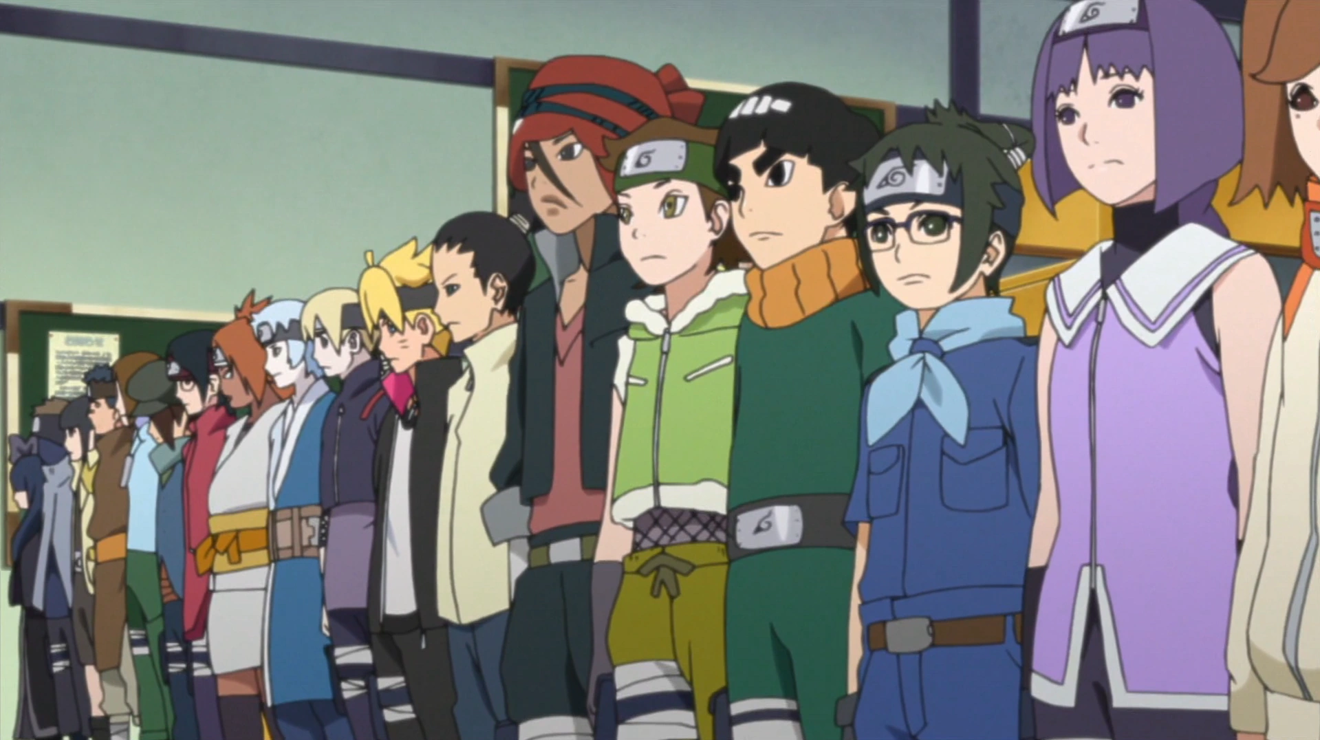
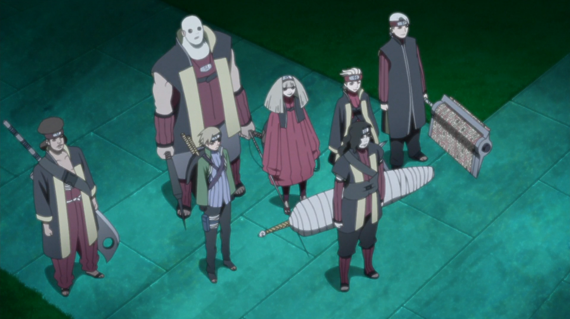
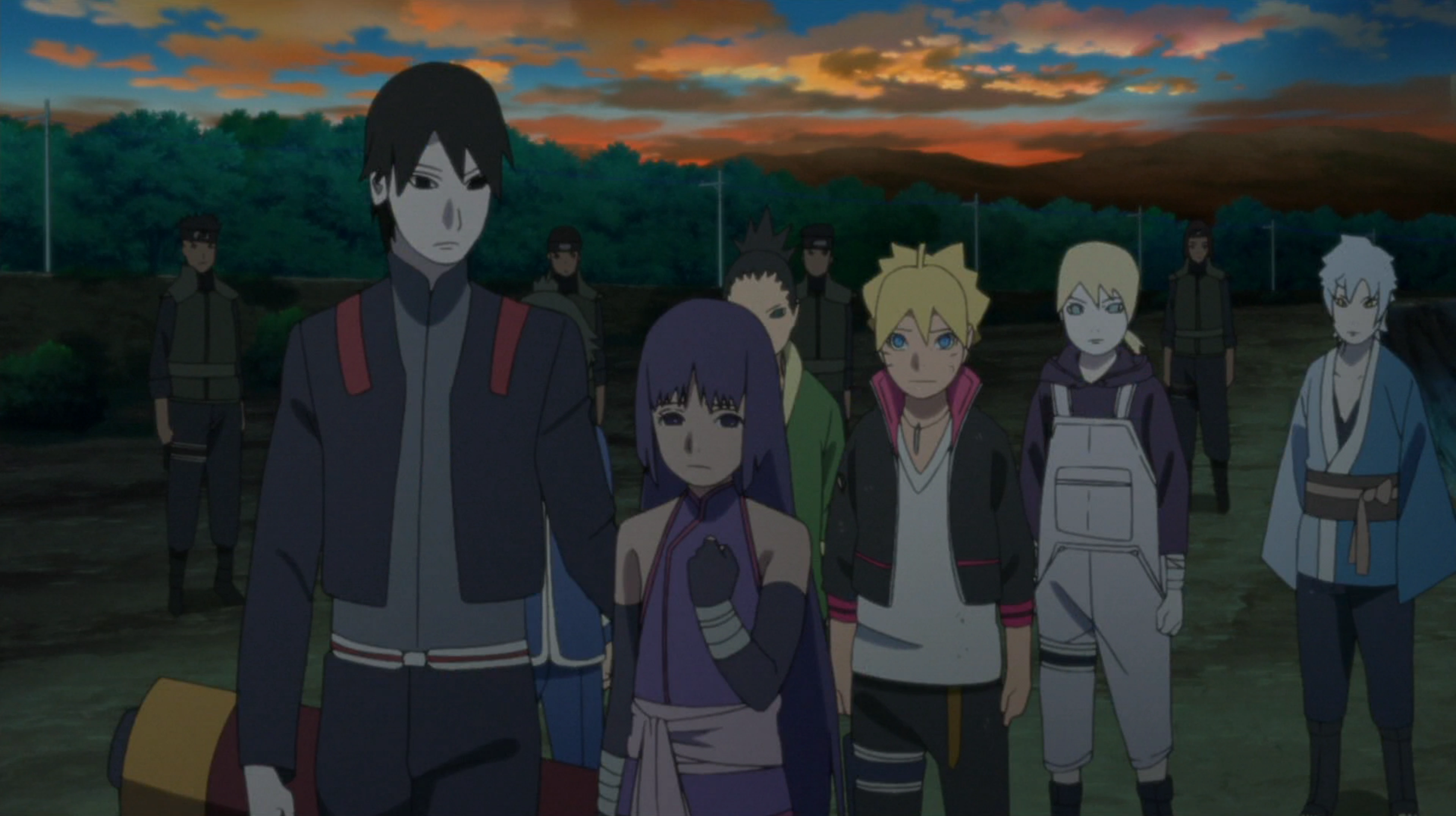
Been meaning to do this for a while...lets talk about Boruto. I liked Naruto in the beginning but then Shippuden dragged on and on that I got kinda of sick of it. At the time of this post I'm about 70-ish episodes in as shounen anime is not something I watch weekly. I find it much easier to watch while marathoning. I'm gonna give my thoughts on the arcs I've seen so far and other stuff pertaining to the show.
Boruto is a perfectly fine show...when its focusing the kids and not the lingering threads from Naruto. The Nue arc, the Hidden Mist Field Trip arc, and Byakuya Gang arc are probably the best examples of where Boruto's strengths as a story lies. I also particularly like the stuff centering around Mitsuki. Though thats mostly because I find it fascinating that he isn't just a pawn in an Orochimaru scheme. Dude just wanted a kid and gave him the free will to follow his own path.
The power scaling regarding the kids seems a bit off. Iwabe I can buy being able to use earth style since he its outright stated that he was held back a lot. I can also understand the kids who have clan specific justu already having mastered them before entering the academy. However, they all seem a bit too skilled in their academy days for kids who aren't even official ninja (Iwabe withstanding cuz again, he is older than everyone else). It irks me in particular that Boruto himself is able to use lightning style right off the bat (though at the very least they do state its his natural chakra element so maybe thats why) and he was able to get the hang of wind style just by watching Mitsuki do it a few times even if he failed to do the wind scythe properly. Him figuring out the Rasengan I can sort of buy but the instinctual elemental change irks me because somehow Boruto can just use lightning style without thinking about it. That felt kinda like they just wanted give him his own custom Rasengan early on to separate him from Naruto.
It also irks me that they seem to have broken the Sharingan a bit. Sarada activates it for the 1st time during the Hidden Mist Field Trip arc without the massive chakra drain that is supposed to happen once its triggered (yeah its worse for non-Uchiha but even Sasuke looked like he was tiring out from using it in the Haku fight besides all the damage he took). She also figured out the copy ability really quickly and thats where another change became evident. The Sharingan seems to scale back the chakra requirements for copied jutsu to something the user can handle now. She copied a lightning style justu and elemental stuff in general is supposed to require a fairly decent amount of chakra on its own. The guys there were facing during this arc were either Chunin or Jonin (can't remember which) so that fight should've been way out of their league since they weren't even Genin yet. Yet they all came out with barely any scratches.
The "prodigy" explanation only goes so far as even though Sasuke was considered a prodigy because he could use fire style, he still had to train and struggle (my head hurts just saying something good about Sasuke). It also really doesn't hold water for a good chunk of Boruto's classmates since we don't know who their parents are.
The opening arc of the show had me hooked after 4 episodes. It was a great introduction Boruto and his classmates. The first few episodes a give you a good feel for how much things have advanced during the time-skip. The later half of the arc centers around some left over stuff from Danzo's foundation. Its also a bit of a revelation that even though the world has moved on since the 4th Ninja War, the Leaf still has some aspects of its past that it needs to deal with.
Despite the weird power-scaling, the Hidden Mist Field Trip arc was really good imo. Its essentially Boruto's class going on a field trip to help build solidarity between the two villages. Their trip happens to coincide with an attempted coup de ta. Boruto befriends Kagura,the front-runner for the title of Mizukage. Sadly the guy leading the coup knows a lot of about Kagura uses his guilt over being related to the Mizukage that instituted the killing exam Zabuza mentioned to manipulate Kagura into joining the coup. Its essentially a really nice, dramatic arc about the Hidden Mist needing to deal with the sins of its past. Its especially effective as Kagura was able to realize that he is not responsible for his family's sins. Its also a nice parallel alongside the first arc.
The Byakuya Gang stuff is really good. Its essentially an arc about a gang of "thieves of justice" from the Land of Snow breaking into the Leaf's science office to steal gadget with data on every jutsu ever created. In order to cover their theft and escape, they actually slowly make the workers in the Leaf village more and more disgruntled until they take to the streets in protest. The subplot is about Shikadai befriending a kid in the part over a game them just hanging out. Naturally the kid winds up being apart of the gang and since Shikadai helped come up with a plan to track them the two come to blows. The kid gets thrown in jail for taking part in the theft but decides to do better when he gets out as he found out that the "thieves of justice" he works for just common crooks during the heist. The kid has this interesting ice style jutsu that hypnotizes people via reflections in the icicles.
The Shin Uchiha arc is just downright stupid and pointless even from a character perspective. The entire thing is about Sarada not being 100% sure Sakura is her mother because of a photo of Sasuke and his old crew from his days with Orochimaru. She goes looking for Sasuke to get the truth from him. You know the drill for this type of setup, she finds "evidence" that Sakura isn't her real mom (the "evidence" led to miscommunication that made her think Karin was her mom) and its revealed its all because of a mix up and that Sakura is actually Sarada's mom. It honestly would've been much better handled if the arc had revealed that Karin was actually Sarada's mom but that Sarada didn't care because she'd only known Sakura as her mother this whole time and Sakura took care of her. The idea that family isn't just blood would've added another layer to this arc. This arc also just glorifies Sasuke so...no, thats points off for it in and of itself. Somehow Sarada doesn't have daddy issues. I legitimately don't understand that.You probably noticed I didn't cover Shin Uchiha...thats cuz he doesn't add much of anything to the arc despite being the villain. Just something about wanting to kill Sasuke for killing Itachi and that he has an army of clones of himself. This is the worst arc out of all of them so far.
The Chunin exam arc was great and I was really digging the updated tests. All the tournament fights were pretty fun to watch. It showed off a lot new and different jutsu and fighting tactics while avoiding dragging the fights out longer than needed. The "Don't cheat!" lesson for Boruto was handled well enough. It was easily my favorite arc at that point...then the stuff with Kaguya's clan crashed right into it and tanked it for me. During that stretch of episodes I just sat there bored and counting down how long I had until the kids (besides Boruto) became relevant again. Not really much kids can do in a fight between gods. It felt a bit like a slap in the face to have an arc centered mainly around the kids and then side-lining them for a less than stellar meta-plot thats trying to help tie up loose threads from Naruto's ninja war arc.
Like I said before, the show is actually pretty fun when its not focusing on the stuff from Naruto or when the characters from Naruto aren't taking center stage. Boruto's plot-line about having issues with Naruto is a bit irritating. Him wanting to step out of Naurto's shadow is perfectly fine. However, him thinking Naruto is a bad father is just dumb. I know he is a kid but someone likely would've explained Naruto's philosophy in great detail to him before his issues with Naruto being Hokage ever got this far. Now that doesn't absolve Naruto of neglecting his family in favor of the village. I can buy him relying on his shadow clones to make sure he can fulfill his duties has Hokage, however I feel the way he does it is wrong. He has his clones spend time with his family so he can do his job as Hokage. Given Naruto's personality, it should be the clones doing the work while he spends time with his family. Another part I don't like is the chosen one plot-line for Boruto as its a tad over-done as far as shounen anime is concerned and its weird that they gave him that when his main goal is to escape his father's shadow. Overall, its an alright show that fans of Naruto will probably like, I just wished it stopped trying to expand on notes from the original show and focused squarely on the kids finding their way in the world.
Boruto is a perfectly fine show...when its focusing the kids and not the lingering threads from Naruto. The Nue arc, the Hidden Mist Field Trip arc, and Byakuya Gang arc are probably the best examples of where Boruto's strengths as a story lies. I also particularly like the stuff centering around Mitsuki. Though thats mostly because I find it fascinating that he isn't just a pawn in an Orochimaru scheme. Dude just wanted a kid and gave him the free will to follow his own path.
The power scaling regarding the kids seems a bit off. Iwabe I can buy being able to use earth style since he its outright stated that he was held back a lot. I can also understand the kids who have clan specific justu already having mastered them before entering the academy. However, they all seem a bit too skilled in their academy days for kids who aren't even official ninja (Iwabe withstanding cuz again, he is older than everyone else). It irks me in particular that Boruto himself is able to use lightning style right off the bat (though at the very least they do state its his natural chakra element so maybe thats why) and he was able to get the hang of wind style just by watching Mitsuki do it a few times even if he failed to do the wind scythe properly. Him figuring out the Rasengan I can sort of buy but the instinctual elemental change irks me because somehow Boruto can just use lightning style without thinking about it. That felt kinda like they just wanted give him his own custom Rasengan early on to separate him from Naruto.
It also irks me that they seem to have broken the Sharingan a bit. Sarada activates it for the 1st time during the Hidden Mist Field Trip arc without the massive chakra drain that is supposed to happen once its triggered (yeah its worse for non-Uchiha but even Sasuke looked like he was tiring out from using it in the Haku fight besides all the damage he took). She also figured out the copy ability really quickly and thats where another change became evident. The Sharingan seems to scale back the chakra requirements for copied jutsu to something the user can handle now. She copied a lightning style justu and elemental stuff in general is supposed to require a fairly decent amount of chakra on its own. The guys there were facing during this arc were either Chunin or Jonin (can't remember which) so that fight should've been way out of their league since they weren't even Genin yet. Yet they all came out with barely any scratches.
![]() |
| They were fighting these guys |
The opening arc of the show had me hooked after 4 episodes. It was a great introduction Boruto and his classmates. The first few episodes a give you a good feel for how much things have advanced during the time-skip. The later half of the arc centers around some left over stuff from Danzo's foundation. Its also a bit of a revelation that even though the world has moved on since the 4th Ninja War, the Leaf still has some aspects of its past that it needs to deal with.
Despite the weird power-scaling, the Hidden Mist Field Trip arc was really good imo. Its essentially Boruto's class going on a field trip to help build solidarity between the two villages. Their trip happens to coincide with an attempted coup de ta. Boruto befriends Kagura,the front-runner for the title of Mizukage. Sadly the guy leading the coup knows a lot of about Kagura uses his guilt over being related to the Mizukage that instituted the killing exam Zabuza mentioned to manipulate Kagura into joining the coup. Its essentially a really nice, dramatic arc about the Hidden Mist needing to deal with the sins of its past. Its especially effective as Kagura was able to realize that he is not responsible for his family's sins. Its also a nice parallel alongside the first arc.
The Byakuya Gang stuff is really good. Its essentially an arc about a gang of "thieves of justice" from the Land of Snow breaking into the Leaf's science office to steal gadget with data on every jutsu ever created. In order to cover their theft and escape, they actually slowly make the workers in the Leaf village more and more disgruntled until they take to the streets in protest. The subplot is about Shikadai befriending a kid in the part over a game them just hanging out. Naturally the kid winds up being apart of the gang and since Shikadai helped come up with a plan to track them the two come to blows. The kid gets thrown in jail for taking part in the theft but decides to do better when he gets out as he found out that the "thieves of justice" he works for just common crooks during the heist. The kid has this interesting ice style jutsu that hypnotizes people via reflections in the icicles.
The Shin Uchiha arc is just downright stupid and pointless even from a character perspective. The entire thing is about Sarada not being 100% sure Sakura is her mother because of a photo of Sasuke and his old crew from his days with Orochimaru. She goes looking for Sasuke to get the truth from him. You know the drill for this type of setup, she finds "evidence" that Sakura isn't her real mom (the "evidence" led to miscommunication that made her think Karin was her mom) and its revealed its all because of a mix up and that Sakura is actually Sarada's mom. It honestly would've been much better handled if the arc had revealed that Karin was actually Sarada's mom but that Sarada didn't care because she'd only known Sakura as her mother this whole time and Sakura took care of her. The idea that family isn't just blood would've added another layer to this arc. This arc also just glorifies Sasuke so...no, thats points off for it in and of itself. Somehow Sarada doesn't have daddy issues. I legitimately don't understand that.You probably noticed I didn't cover Shin Uchiha...thats cuz he doesn't add much of anything to the arc despite being the villain. Just something about wanting to kill Sasuke for killing Itachi and that he has an army of clones of himself. This is the worst arc out of all of them so far.
The Chunin exam arc was great and I was really digging the updated tests. All the tournament fights were pretty fun to watch. It showed off a lot new and different jutsu and fighting tactics while avoiding dragging the fights out longer than needed. The "Don't cheat!" lesson for Boruto was handled well enough. It was easily my favorite arc at that point...then the stuff with Kaguya's clan crashed right into it and tanked it for me. During that stretch of episodes I just sat there bored and counting down how long I had until the kids (besides Boruto) became relevant again. Not really much kids can do in a fight between gods. It felt a bit like a slap in the face to have an arc centered mainly around the kids and then side-lining them for a less than stellar meta-plot thats trying to help tie up loose threads from Naruto's ninja war arc.
Like I said before, the show is actually pretty fun when its not focusing on the stuff from Naruto or when the characters from Naruto aren't taking center stage. Boruto's plot-line about having issues with Naruto is a bit irritating. Him wanting to step out of Naurto's shadow is perfectly fine. However, him thinking Naruto is a bad father is just dumb. I know he is a kid but someone likely would've explained Naruto's philosophy in great detail to him before his issues with Naruto being Hokage ever got this far. Now that doesn't absolve Naruto of neglecting his family in favor of the village. I can buy him relying on his shadow clones to make sure he can fulfill his duties has Hokage, however I feel the way he does it is wrong. He has his clones spend time with his family so he can do his job as Hokage. Given Naruto's personality, it should be the clones doing the work while he spends time with his family. Another part I don't like is the chosen one plot-line for Boruto as its a tad over-done as far as shounen anime is concerned and its weird that they gave him that when his main goal is to escape his father's shadow. Overall, its an alright show that fans of Naruto will probably like, I just wished it stopped trying to expand on notes from the original show and focused squarely on the kids finding their way in the world.
Subscribe to:
Posts (Atom)