Showing posts with label Maskman. Show all posts

Tuesday, December 17, 2019

Sentai Suits Through The Ages: The 80's

Now we make our way into the 80's. I forgot to mention this in the 70's post but a good chunk of the early Sentai suits were made of cloth, not spandex. So this decade is notable for a change in material even though early seasons in this decade still used cloth.

Denzi Sentai Denjiman:
These suits have a somewhat simple design and the white stripes across the torso help break it up a bit. The big D on the belt looks good as does the D on the chest. The white gloves and boots work well with all 5 colors as do the bands on them. The sculpted mouth-pieces look a bit rough to me but it helps with the team's distinct look so its fine. The glass covered circuitry, lights, and wiring in the helmets is a nice touch and it gives them a nice sci-fi/alien vibe. In addition to the visors being different shapes, the glass coverings are also different shapes so it adds some extra variety to the helmets. The yellow highlights on DenjiRed's helmet work well with the red. A nice little detail is that the belts includes their initials on the buckles. The scarves are also a really nice touch to have on Sentai suits in general.

Taiyo Sentai Sun Vulcan:
The suits look alright and I like the sun emblem on the chest. The white Vs on the chest looks pretty good and help break up the colors a bit. The helmets are the highlights of these designs imo as there is some nice detail on the animal designs. The shark on VulShark's helmet has gills and molded teeth. The yellow on VulEagle's helmet works well with the red. The silver mouth-pieces on the helmets look pretty good and add that little bit extra to the suits. I think it probably works best on VulEagle since the silver is flanked by the yellow. The colored Vs on the gloves and boots work well with the white on them. Also these suits have scarves which are just a cool touch in general that I want the franchise to bring them back.

Dai Sentai GoggleV:
The helmets look a bit too big for the suits to me but that might be due to the molding around the visor combined with the size of the silver mouth-pieces. The molding is gold on Red and Black and it works well with their colors. It also has this aged metal look to it which is a really nice touch. However, its silver on Blue, Yellow, and Pink and it works well with those three colors though I think it works slightly better on Blue and Yellow. The sculpted mouth-pieces look good though a bit too big but that is probably because they extend to the entire bottom jaw. It adds an extra bit of cool to them tho. The gems in their foreheads help add to the ancient relic vibe. The white on the chests works well with all 5 colors and the gold buckles on the belts work well. The gold emblem on the chest looks pretty good too and works well with the white chest. I like how the white gloves are broken up with a stripe matching each one's colors. The scarves on the suits are a nice touch but after how much I've gushed about scarves the last few times they've shown up, you probably knew I'd say that.

Kagaku Sentai Dynaman:
Two things to note right off the bat are the material and motif. This was the first Sentai to have spandex suits as they were made of cloth until this team. As for the motif, its probably well known by now but this was originally supposed to be a baseball themed team and you can tell. From the helmets to the torso to the lines down the legs, this sort of screams baseball Sentai. The white pants works perfectly with their colors and makes them really pop. The boots and gloves matching their main colors are a nice touch and I'm always glad to see Sentai suits doing this. The gold/yellow highlights on Red, Blue, and Pink work well with their colors. DynaYellow has all his gold highlights replaced with black and it helps make the yellow stand out a lot. The red highlights on DynaBlack look pretty good with the black on his suit. The gold on the helmets looks good with all five's colors and the silver mouth-pieces look good. Its a pretty solid design and a great first outing for the change to spandex.

Choudenshi Bioman:
The overall design is pretty simple and sleek but still unforgettable. They have this nice alien look about them while also looking pretty hi-tech. The circuit board going across the chest is a nice touch. The white compliments all 5 colors really well and makes the colors stand out more. The expanded white portions on the legs of Pink and Yellow makes them look a bit like they're some kind of wearing leggings on their suits. The helmets have super computer lights going through them and they can actually light up via practical effects. Its a nice touch and it feels like a step up from Denjiman's helmets. The panels on each helmet look great and the silver works well on each helmet. The silver headband look on top of the visors looks pretty good with the silver mouth-pieces. The Bioman emblem looks great in the belts and the gold contrasts well with the black on the belt. The silver bands wrapping around the white gloves and boots looks pretty good.

Dengeki Sentai Changeman:
These suits look pretty good. The yellow highlights on Red, Blue, and Black's helmets look pretty good and helps the colors pop. The pink highlights look pretty cool on Change Mermaid and really compliments the gold on her arms, belt, and boots. The white highlights on Change Phoenix's helmet look pretty good and compliment her color really well. The gold belts and bands look pretty good with all 5. Though I'd say it probably works the best on Change Mermaid for reasons mentioned earlier in this section. The white chest on all of them makes me think body armor and the emblems on all 5 helmets look pretty cool. The emblem on the chests looks pretty nice and I like how it shows off all 5's colors. Also the white portion of the emblem doesn't break up the symmetry of the chest design since its angled right where the corner of the design would be.

Choushinsei Flashman:
These suits are downright beautiful. It was discussing these suits with friends that actually made me want to do this series of posts. Whoever designed these suits got them perfect. They sell the sci-fi vibe really well. They're all pretty sleek looking and stylish. Each one's signature color works really well with the white portions and the black stripes going down the sides makes them pop, especially on the female suits. The helmets look nice and space-y and the prisms on them are a nice touch.I especially love the way the visor's open up. The silver mouth pieces look good with the white sides of the helmet and each one's main color. The colored bands next to the white gloves and boots look pretty cool. The bands above the boots look the best on Pink and Yellow due to the white leggings and the previously mentioned black stripe going down the sides. The suits manage to look both retro and futuristic at the same time so its a pretty timeless design imo. They are without a doubt my favorite suits out of this decade and some of my favorite suits in the franchise.

Hikari Sentai Maskman:
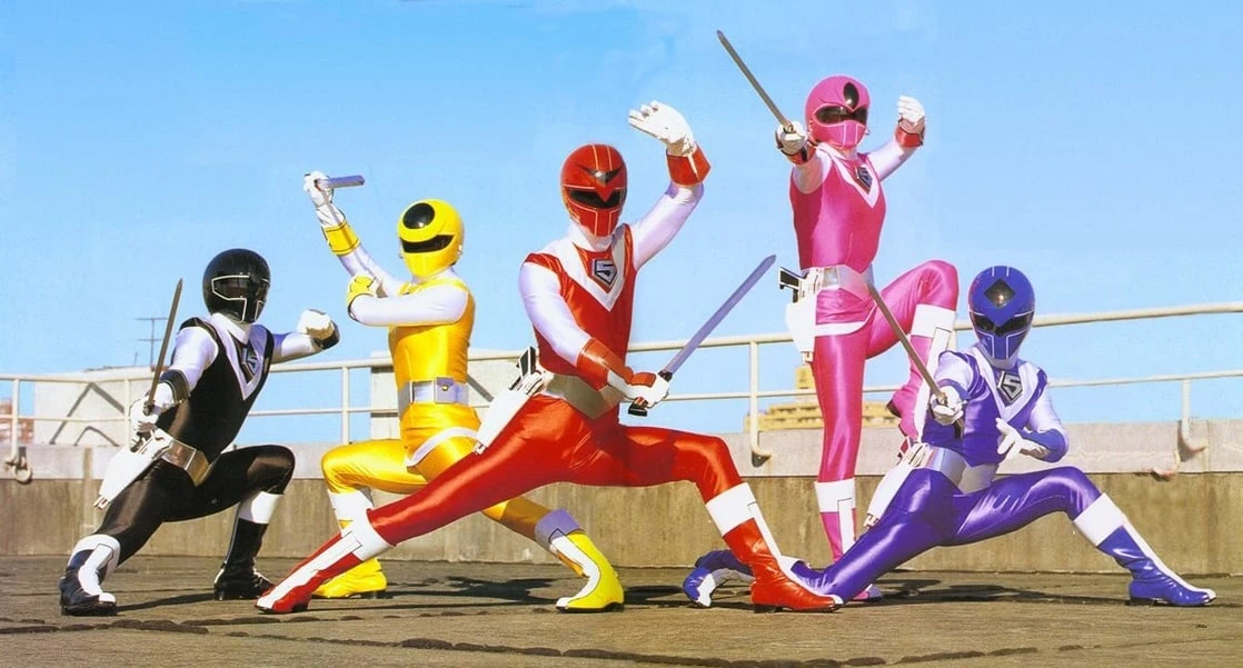
These are probably my second favorite suits from this decade. These designs are just straight up classic. They're pretty sleek and stream-lined and the big 5 logo looks cool. The white on the suits works well with all their colors and makes them pop. The white gloves look cool with the colored guards on the back. Its a detail I kinda wish Sentai would bring back. The white streaks down the boots look pretty good. In place of a belt, these suits have a white stripe between the torso and legs and it complements the overall design really well. The helmets look great with the white highlights and I love the earrings on Pink and Yellow. The earrings are a small detail you likely wouldn't notice outside of close-ups but when you do notice them, it makes Yellow and Pink's designs look even better. If I had to pick between the helmets, I'd say Red Mask's helmet is probably best because of how the white highlights are aligned.

Choujuu Sentai Liveman:
The helmets look fantastic and they capture each animal nicely. I particularly like the molded fangs on Yellow Lion and the horns on Green Sai. The white on all 5 helmets were makes their colors pop and the yellow beak on Red Falcon's helmet looks pretty good. I adore the silver mouth-pieces. The animals on each suit look great inside the giant white Vs. The white pants and sleeves help balance out their colors nicely and the blue trim on Blue Dolphin's skirt is a nice touch. The silver bands on the colored gloves and boots compliment all of their colors pretty well. The silver belts with the colored jewels in the middle look pretty good and work well with the rest of the suits.

Kousoku Sentai Turboranger:
The white going down their chests works well with all 5 colors. The yellow highlights around the chests of Blue, Pink, Red, and Black looks good and works well with their colors. However, I think the black highlights on Yellow's chest look the best. The emblem on the chest looks pretty good and it helps sell the car motif since its basically an engine. The helmets capture the car motif rather well and the silver highlights look pretty good on all 5 helmets. The silver mouthpiece looks pretty good with the helmets and as you can tell from previous sections, its shown up quite a lot during this era of Sentai. The gold bands on the gloves and boots look pretty good on all 5 suits but they are a little hard to see on Yellow's. They look pretty cool overall and are a nice way to close out this decade of suit designs.

This era of Sentai probably resulted in some of the most memorable designs in the franchise. Flashman, Liveman, and Maskman are probably the standout designs of this era. Denjiman and Sun Vulcan are alright overall despite being kinda simple and they still do have notable features to them. They feel a little like a hold-over from the 70s to me. Overall, the 80s are pretty strong decade as far as the designs go.

Monday, November 28, 2016

My Favorite Sentai Suits: Team Looks

Since I did a post for the individual suits, I'm going to do one for team looks now. How a suit looks by itself is important but equally important is how it looks next to the other members of its team. Due to this being based on visuals, I'll be including suits from series I haven't finished yet. I couldn't think of a good order for these so they will not be ranked. Note: these are not actually all of my favorite suits because this would be far too long if I were to list them all.

Hikari Sentai Maskman:
These are probably my favorite Pre-Zyu sentai team suits. They're rather nice and simple looking. They're also very sleek, stream-lined and easy to identify at first glance. The white portions of the suits makes all five colors pop really well. I particularly like the white streaks on the boots. The big 5 logo on the chest looks great. Sentai has used white gloves for a lot of teams but they really work well here. Its probably because of the colored guards on the back of the hands. I absolutely love the different designs on the helmets. Another detail I really like is that Yellow Mask and Pink Mask's helmets have earrings on them.

Kyoryu Sentai Zyuranger:
Nice and simple yet hard to forget. They have a very classic look to them. The white portions really complement all each member's color. The helmets have a lot of nice detail to them. I especially like the trunk pattern and tusks on Goshi's helmet. I love the belts for the Zyurangers. Something about the henshin device being their belt buckles really clicks with me. Out of all six, Burai's suit is probably my favorite. The gold works really well with the green and the gold Dino Buckler completes the look.

Kaizoku Sentai Gokaiger:
These are probably my favorite of the most recent sentai suits. I love the pirate hat sculpting on the helmets. It works really well with the jackets. The black spandex complement the colors for all six really. The gold stripes and belts work really well with all six colors. These suits really sell the pirate motif at first glance. My favorite suit out of these six is probably GokaiSilver's. I love the anchor design on the top of the helmet and the colored visor looks great alongside the silver suit.

Gosei Sentai Dairanger:
The gold portions of the helmets look great and have some really nice detail to them. The white portions of the main five's suits work really well with the gold trim and complements their colors rather well. I love the way the Dairanger emblem looks. Kibaranger's suit looks great. The black and gold chest-plate complements the white really well. I also like how the gold bands are outlined in black. I especially love the gold belts on all six suits.

Bakuryu Sentai Abaranger:
These suits look great together. The white spike patterns on Ryouga, Yukito, and Ranru's suits complement their colors rather well. The gold spike patterns on Asuka's suit complement the black really well. The black spikes complement Mikoto's white suit really well and I particularly like the gold trim on the chest-plate. It looks just different enough from the other 4 to stick out while looking just similar enough to feel like it belongs with them.

Choushinsei Flashman:
Seeing these suits in Gokaiger was what made me originally want to watch Flashman. These suits have a very nice space-age and hi-tech feel to them while managing to look simple. The black on the sides of the suits really help complement the each of their colors and I particularly like the darker shade of green for Green Flash. The helmets pretty much scream "This is alien tech!". Like the stripes on the sides of the suit, the black outlines on the top of the helmets help complement the colors as does the white. A detail that I really love is that the visors are actually retractable. The design of the emblems are nicely done.

Mirai Sentai Timeranger:
I absolutely love the colored visors and its something I'd like to see done more. The black on the helmets really help the visors pop. The white on the suits complements each color nicely. The sculpted mouth pieces really suit them well. I like how the braces don't vanish when they're transformed and are actually worked into the arm-piece of the suits. The silver arm-pieces and belt buckle look great with the black on them. I love the design of the belts.

Choudenshi Bioman:
Like the Flashman suits, the Bioman suits manage to look simple yet hi-tech at the same time. The white really complements each color. I like the Bioman emblem, its nice and simple. It being integrated into the belt works rather well. The emblem looks great with the black on the belt. The helmets look really hi-tech thanks to the domes on the head with visible circuits. The circuit board pattern across the chest helps sell the look as well. The sculpted mouth-pieces on the helmets really mesh well with the rest of the suits.

Tokusou Sentai Dekaranger:
These suits look great together and they just might have my favorite overall look. The silver highlights on the main five's helmets work really well. I think the main five having one black arm is a nice look. I like how each Dekaranger's number is plastered on their chests. Despite the differences from the main six, DekaMaster and DekaSwan's suits compliment the over-all look of the group very well. They also look like a natural evolution of the main six's suits. Those two also happen to be my favorite suits out the Dekaranger suits. I especially love the more armor-like look they have. DekaBreak's suit is probably the best in terms of overall color combination. The blue, gold and white complement each other very well.

So yeah, those are just some of my favorite suits. There are more that I absolutely love but I didn't want the list to run too long. These are simply the first suits that came to mind when I decided to do this list. In all honesty, there really aren't that many suits in Sentai that I don't like.

Monday, September 7, 2015

Hikari Sentai Maskman First Impressions

In addition to Bioman's first two episodes, I also watched Maskman's first 4 episodes. Like with Bioman, I normally wouldn't do this since its not a currently airing show but man did it give me a lot to talk about. Lets get right into it.
One thing I really enjoyed is that the series wastes no time in throwing you right into the action. The very first scene with Tube is them declaring war on the surface world and causing massive damage with an aerial strike. Like Bioman's first episodes, doing that really helps establish the threat and cranks up the stakes. Its been a while since I've seen villains that don't screw around in their first outing. Heck, at the end of episode 2, they do something that feels like the end game moves you would normally see for series finales. Also, I love the way Tube handles traitors. Instead of death, they get subjected to eternal sleep and dreams filled with their worst nightmares. They also feature a very nice variety in designs. A majority of the main members are human looking villains which as I said in the Bioman post is something I miss nowadays.
The flashbacks showing Mio and Takeru's budding relationship was a nice touch. Normally, I'd roll my eyes when I see something like that in the beginning of a series but the show does a nice job of making the relationship known. I honestly feel bad for the guy and I want to see him get her back.

One thing that really surprised me was when they were training to unlock Aura Power in episode 3. Takeru got distracted because he was thinking about Mio during meditation. That caused an energy feedback that threw them all over a cliff and no one tried to punch him for messing up. I'm not even kidding, I expected Kenta to slug him once they got back on their feet. Its a sad thing that I'm just so used to modern styles that I instinctively expected the heroes to be jerks to each other early on. Heck they even followed Takeru when they heard Mio's voice. It was really rather refreshing to see. It really shows solidarity in the team and that everyone understands what Takeru is going through. The training itself was nice to see. I'm always a sucker for training montages.
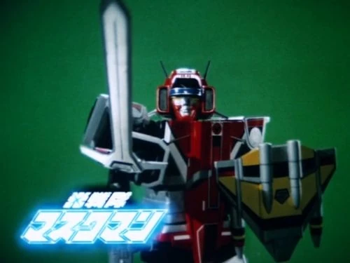
I like the prop-work for their individual mecha. They are really well made. I'm almost convinced that Red Mask's fighter jet is remote controlled since the way it flies, turns, and dives seems a bit too complex for it to just be done with wires. I like Great Five's transformation sequence. Its rather simple and the details on the models are excellent. The suit itself is very nicely sculpted and all the colors mesh pretty well.
I like the suit designs. They're all simple and sleek yet very easy to identify at first glance. I don't usually comment on the designs for the visors but they have a nice variety for just being one team. The white portions of the suits really complement each color and I like the big 5 logo on the chests. I find it a strange yet nice detail that Pink Mask and Yellow Mask's helmets have earrings attached to them.
Overall, I enjoyed these 4 episodes. It gave a great first look at its concepts while also managing to make the characters endearing right out of the gate. Mio and Igam being played by the same actress is a nice touch since the characters are twins. The show does a nice job of shooting around that by doing over the shoulder shots when both characters share a scene. The theme song is nice and energetic and the ending theme is enjoyable. The action was well handled. The episodes themselves manage to squeeze in a lot in a short amount of time. The episodes don't even feel that long. I can tell that I've got a lot to look forward to in this series. I'm going to put this on my watch-list for after Gingaman and Jetman.

Friday, September 5, 2014

My thoughts on the pre-zyu suits being shown in Super Megaforce

Now this is something that has gotten some fans up in arms. Reasoning has ranged from "They're dishonoring PR by using these suits" or "They're just trying to piggy-back on Sentai's growing popularity in the US". This has aggravated me too but not for those reasons. My reason for being aggravated is that I find it to be a bit disrespectful to the audience as they have yet to explain it. The suits show up so quickly it looks like the editing department was too lazy to cut them out and just hoped no one would notice. The show doesn't want to explain why its altering its continuity by technically making these suits canon.
Writing them off as new powers accessible via Super Mega mode can only stretch so far. In addition to adding the Dairangers, they've also snuck in Yellow Mask and Pink Flash. I sort of give Dairanger a pass because they are post-Zyu and somewhat had a presence in MMPR thanks to the Thunder Zords and Kibaranger being used as the MMPR white ranger. However, there is was no reason not to edit out Yellow Mask and Pink Flash.
They've essentially blown a hole in their own continuity without giving it a proper explanation. It makes the writing department seem lazy when all they need to do is write a short line that roughly says "Your new mode lets you access powers that are from space.". Yeah Zordon did indeed say back in MMPR that there were rangers on other planets but most of their current target audience (young children) probably won't know about that or much about MMPR in general so they won't know to go looking for that piece of continuity. That is all the more reason why they should explain it in-universe for Super Megaforce. It makes me ask why they even bothered to reshoot anything except for Don's GokaiGreen footage if they're gonna let some suits slip through. Heck, Green Flash got a full 3 minute fight scene in the episode "Power of Six".
Some fans have taken it upon themselves to come up with theories to explain their inclusion and while that is a valiant effort, it just doesn't feel right for them to have to do that. It is ridiculous for Saban Brands to expect the fans to fill in the gaps themselves when the burden of explanation rests squarely on the shoulders of their company, not the fans. I'll be keeping a count of all these instances until we get a proper explanation other than the vague "They're powers never before seen on Earth" line. That doesn't just mean they're from space, it could mean they're powers that were stockpiled but never actually given to anyone or a lot of other things.
These suits only being shown for a few seconds (or minutes in Green Flash's case) doesn't make them any less real and they deserve an explanation. In short, do I find it disrespectful? Yes but not for the same reasons that some of the fandom have. Do I find it lazy and inconsistent? Oh most definitely. I wonder just what other suits they'll let slip through.